I am simple.
My interest in all things design began when I was really young.
Art, for me is a hobby that has amazingly turned into a career.
To me, good design is simple, elegant and timeless. It remains beautiful and relevant over the years.
My personal style is minimal but bold. I also love quirky expressive designs that bring out personality and life.
People's Choice Awards KE. - Graphic Designer of the Year 2024.
-
 VIEW
VIEWPersonal Brand
Logo Design -
 VIEW
VIEWNFNS Limited
Logo Design -
 VIEW
VIEWSEMA Brand
Brand Design -
 VIEW
VIEWPFP Book
Publishing Design -
 VIEW
VIEWAIfluence Inc.
Logo Design -
 VIEW
VIEWIshoke brand
Brand Management -
 VIEW
VIEWArdhisasa Logo
Logo Design -
 VIEW
VIEWParenting Book
Publishing -
 VIEW
VIEWMalipo Recovery
Service Logo -
 VIEW
VIEWAVL Packaging
Packaging Design -
 VIEW
VIEWNdovu Coin
Logo Design -
 VIEW
VIEWBaridi Brew
Product Packaging -
 VIEW
VIEWATU - UAT
Rebranding -
 VIEW
VIEWMy Ramadan Book
Publishing -
 VIEW
VIEWLylisa Cakehouse
Logo Design -
 VIEW
VIEWE. L. Foundation
Brochure Design -
 VIEW
VIEWChez Website
Web Design -
 VIEW
VIEWMove Conference
Logo Design -
 VIEW
VIEWAngie Kyst
Logo Design -
 VIEW
VIEWCoffiGold Packaging
Packaging Design -
 VIEW
VIEWBoutique Affairs by Ruthie
Rebranding -
 VIEW
VIEWJust Nyama
Logo Design -
 VIEW
VIEWThe SEMA Brand
Campaign Logo -
 VIEW
VIEWRootooba Limited
Logo Design -
 VIEW
VIEWRetirement Book
Publishing Design -
 VIEW
VIEWCoffee Gold
Packaging Design -
 VIEW
VIEWN.F. Limited
Logo & Packaging Design -
 VIEW
VIEWWordArt Decor
Decor -
 VIEW
VIEWHoney label
Packaging Design -
 VIEW
VIEWThe DNDI Conference
Conference Branding -
 VIEW
VIEWAPAC Congress
Congress Branding -
 VIEW
VIEWThe ASBC Congress
Congress Branding -
 VIEW
VIEWUnited Bible societies
Editorial Design -
 VIEW
VIEWAmma Tito BBQ Invite
Invitation Card -
 VIEW
VIEWEtica Capital Limited
Logo Design -
 VIEW
VIEWRed Paper Limited
Logo Design -
 VIEW
VIEWZuriah Beauty Lounge
Social Media Managment -
 VIEW
VIEWSiwara Limited
Logo Design -
 VIEW
VIEWKusudi
Logo Design -
 VIEW
VIEWApplewood Hospital
Logo Design
-
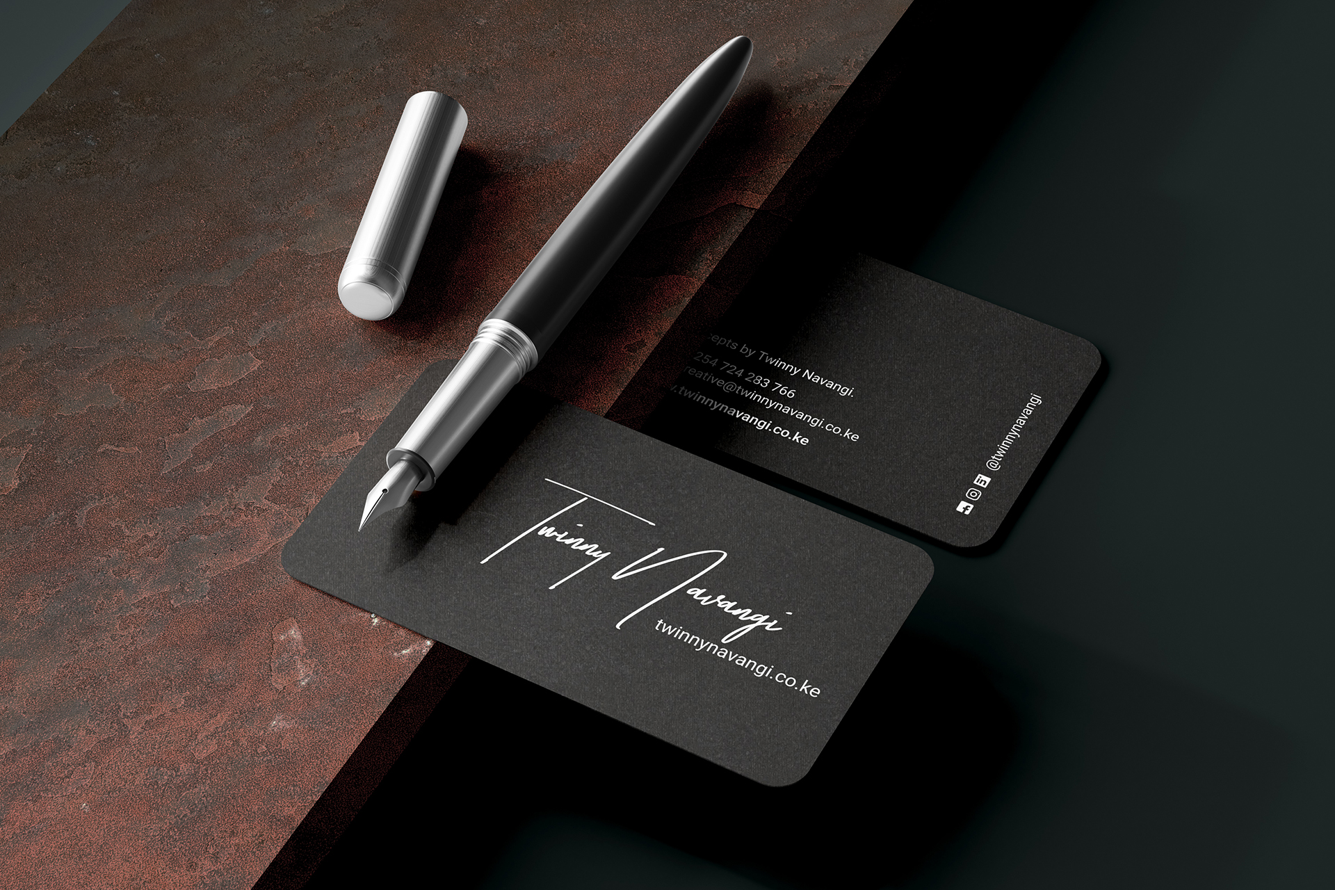
THE TWINNY NAVANGI BRAND
Twinny Navangi
I am a professional with over 12 years’ experience, working with design agencies, international organizations, publishing houses and with local companies.
My work is not limited by location as I have successfully worked with international companies and managed support partners such as printers, consultants & event managers etc., remotely.Over the years, my professional experience has grown from basic design activities such as logo design, digital design, print design, publishing design and web design to macro creative activities such as brand management, formulation of creative strategies, social media management, marketing strategies, corporate communication strategies, brand building activities, team management among others.
My pesonal and professional skills include;
A self-starting attitude
Exceptionally organized
Leadership skills
Exceptional planning and organization skills
Exceptional time management skills
Analytical problem-solving skills
People and project management skills
Time-management skills
Ability to empathize with clients and team members.
-
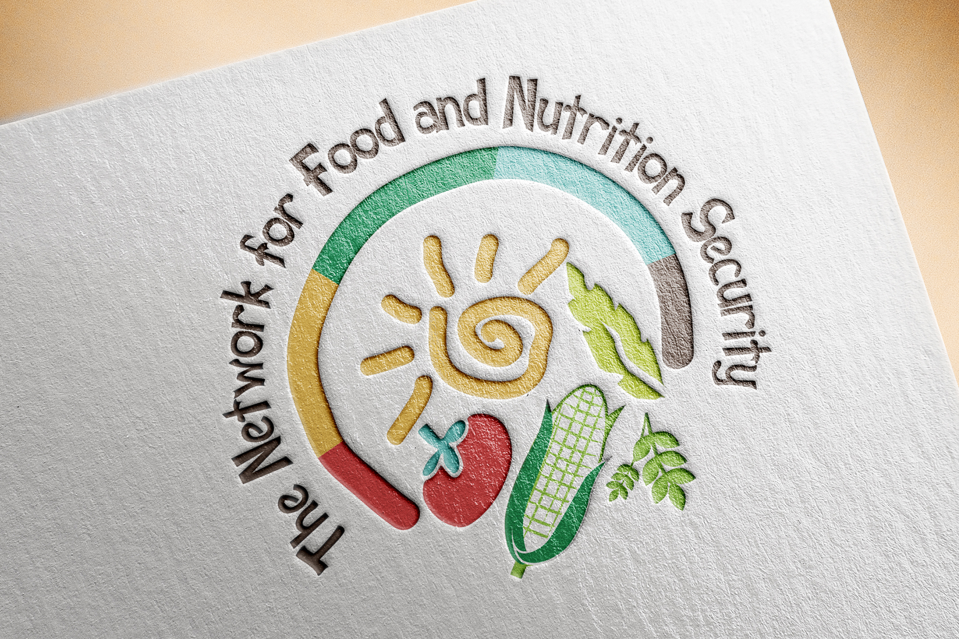
THE NFNS LOGO DESIGN
Client: The Food and Nutrition Security Network (NFNS)
The Food and Nutrition Security Network (NFNS)is a consortium of women- and youth-led community organisations working on food security and nutrition in different communities in Kenya.
The Network brings together women and young people and their organisations - including self-help groups, community based organisations and NGOs; learning institutions; entrepreneurs and individuals with special interest and knowledge on different aspects relating to food security.
The NFNS logo uses various symbols to bring out the message of food security. Hope and knowledge are represented by the sun symbol, the fruit and vegetable symbols represent food security, while the enclosing circle in different colours represent different sections of the community that come together to protect food sources and to share knowledge.
-
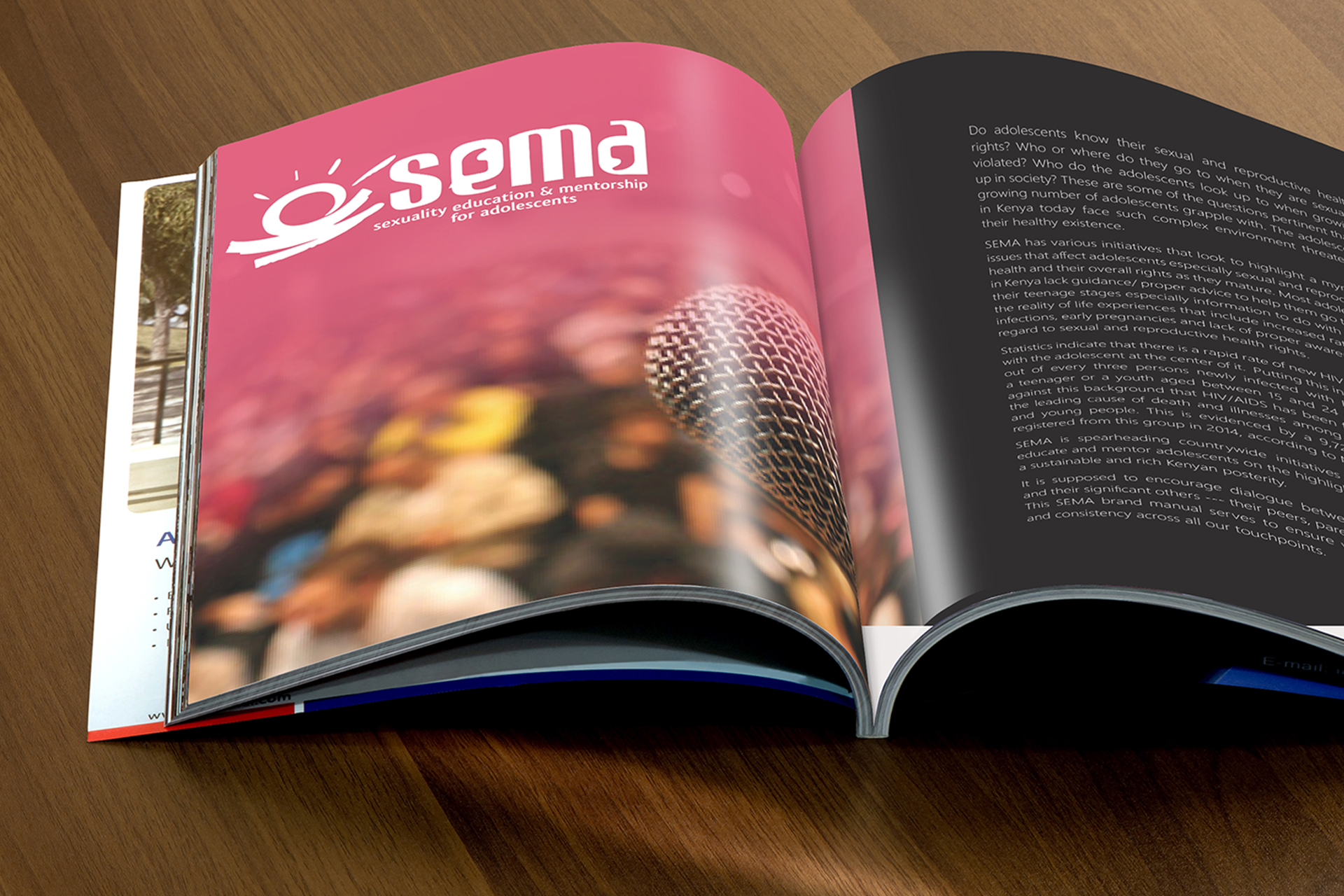
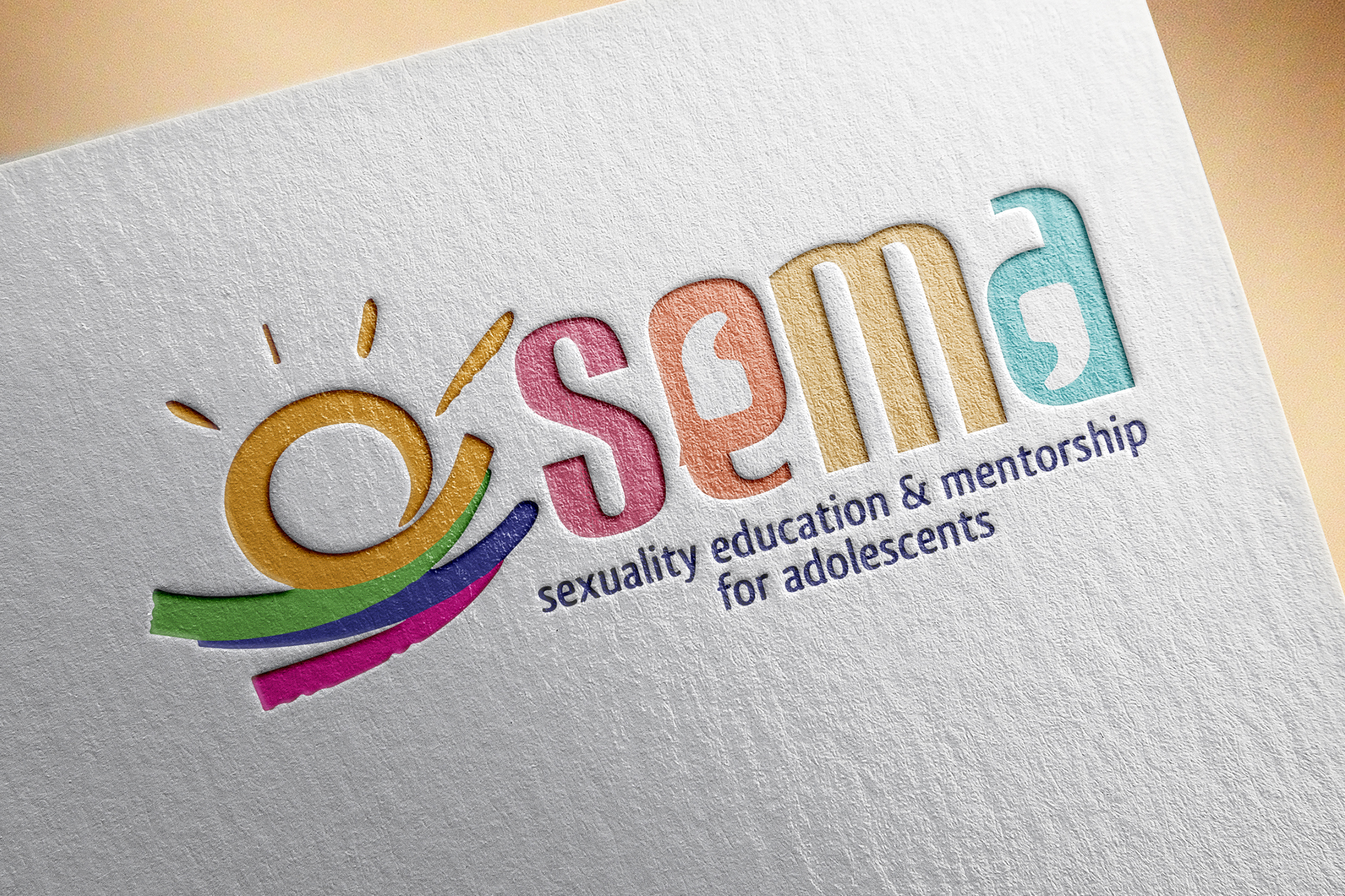
THE SEMA BRAND LOGO DESIGN
Client: Kusudi Cause Communications Limited
SEMA (Sexuality Education & Mentorship for Adolescents) is a foundation that spearheads countrywide initiatives to empower, educate and mentor adolescents on the highlighted issues for a sustainable and rich Kenyan posterity.
The SEMA logo is modern, youthful, symbolic and full of life. The logo uses the sun and quotation speech marks (‘ )as its major symbolism. The speech marks symbolize conversations between the adolescents and other members of society.
The logo uses vibrant colours to make it lively and youthful to symbolize ‘youth’. The diverse colours used in our logo represent the various needs/issues affecting the adolescents and the ‘bridge’ under the sun symbol shows the organizations’ intention to act as a bridge between the adolescents and other members of society. -
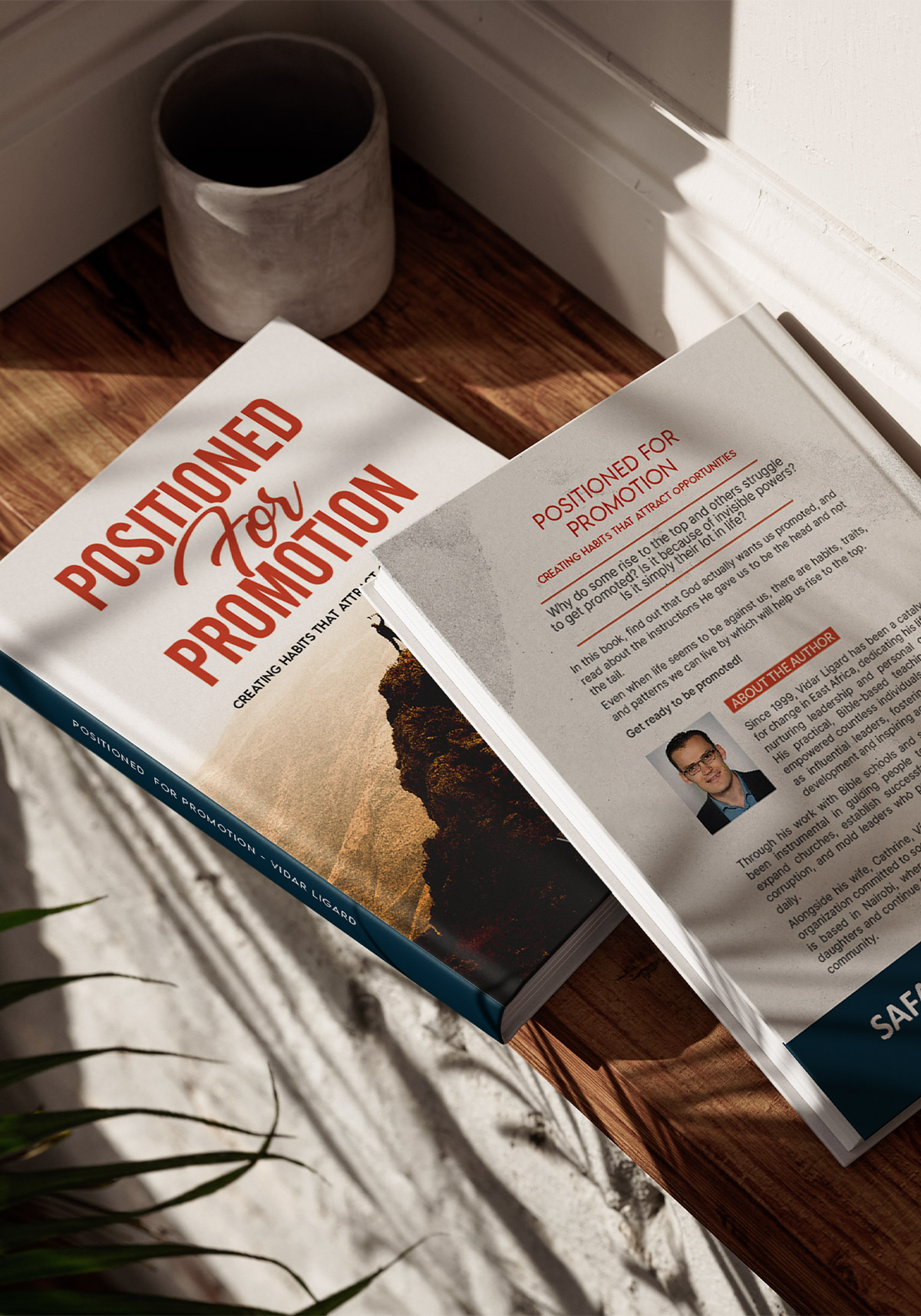
POSITIONED FOR PROMOtION
Client: Vidar Ligard
It was such an honor to design this book among many other titles for Vidar Ligard, a man who has spent over two decades in East Africa raising leaders, inspiring growth, and sparking lasting change.
His Bible-based teachings have helped thousands build thriving communities, expand churches, and step confidently into their calling. -
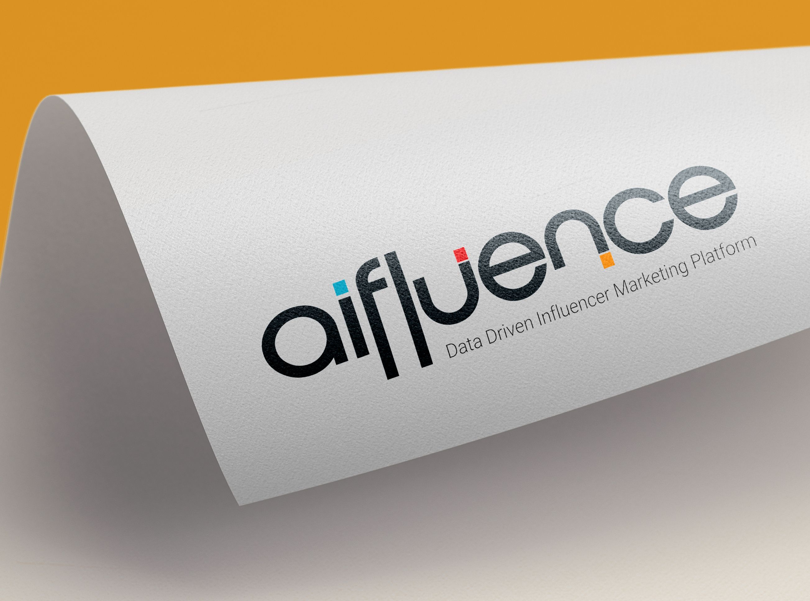
AIFLUENCE LOGO DESIGN
Client: AIfluence Inc.
AIfluence is Africa's first AI-Powered influencer marketing platform offering an end-to-end solution to optimize and scale global influencer marketing strategies with advanced algorithms that power influencer discovery and evaluation, campaign management and performance measurement for both organic and paid influencer marketing campaigns.
The AIfluence logo design was insired by magnets... Influencers are the modern day marketing magnets for any company.
In this logo design, the letters ‘u’ and ‘n’ have been designed to create ‘magnets’ to symbolize how influencers attract potential customers -
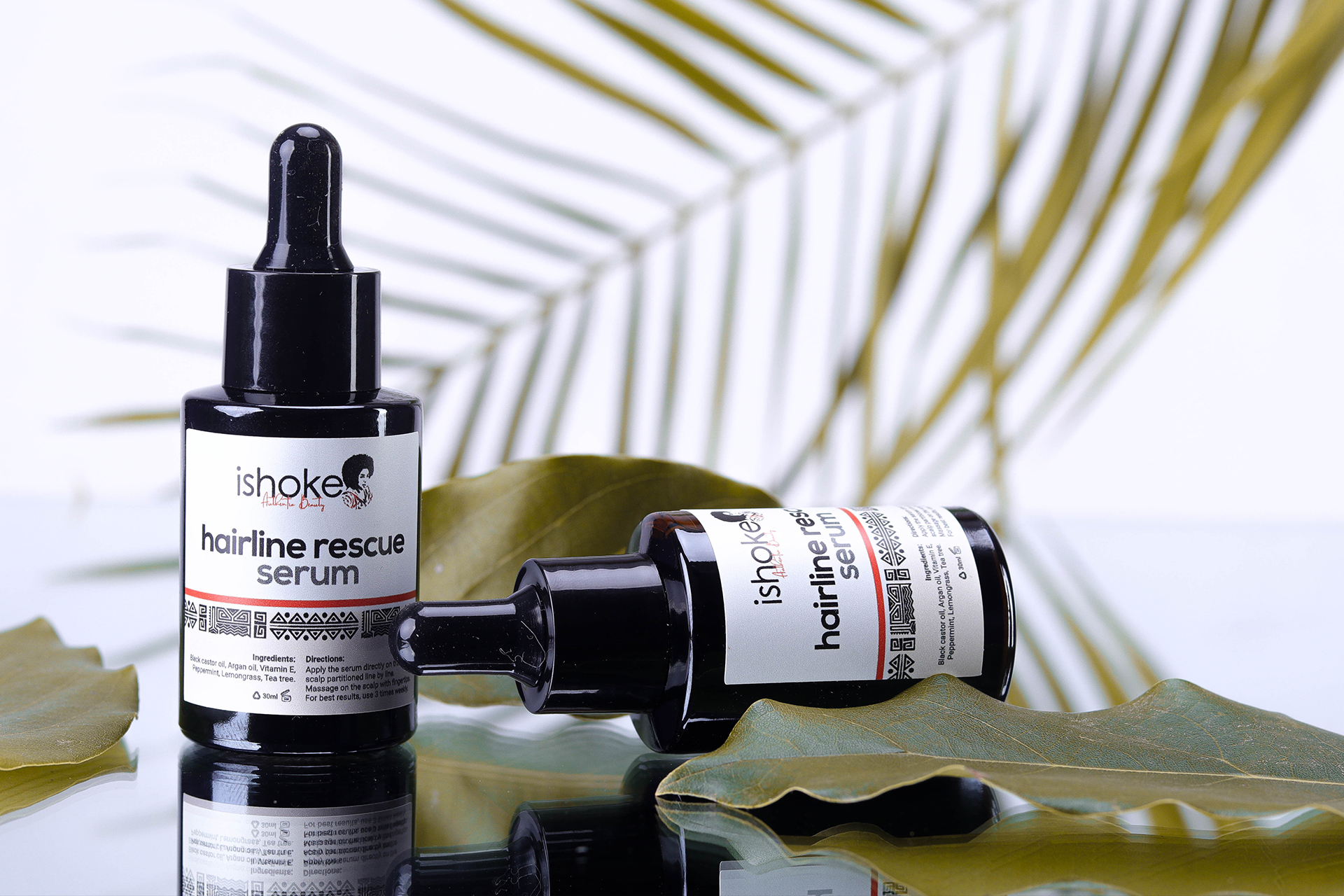
ISHOKE LOGO & PACKGING DESIGNS
Client: Ishoke Enterprises
Ishoke is a natural hair line whose core value is to provide quality 100% natural products for the scalp and hair. I was tasked to design this brand's logo and as a key feature, - the clients own old photo had to be incorporated into the logo design! This was one of the tickiest designs to do - but after several concepts, I finally came up with a unique logo that the client and I were proud of.
My relationship with this brand then grew from logo design to packgaing, advertising and social media management.
-
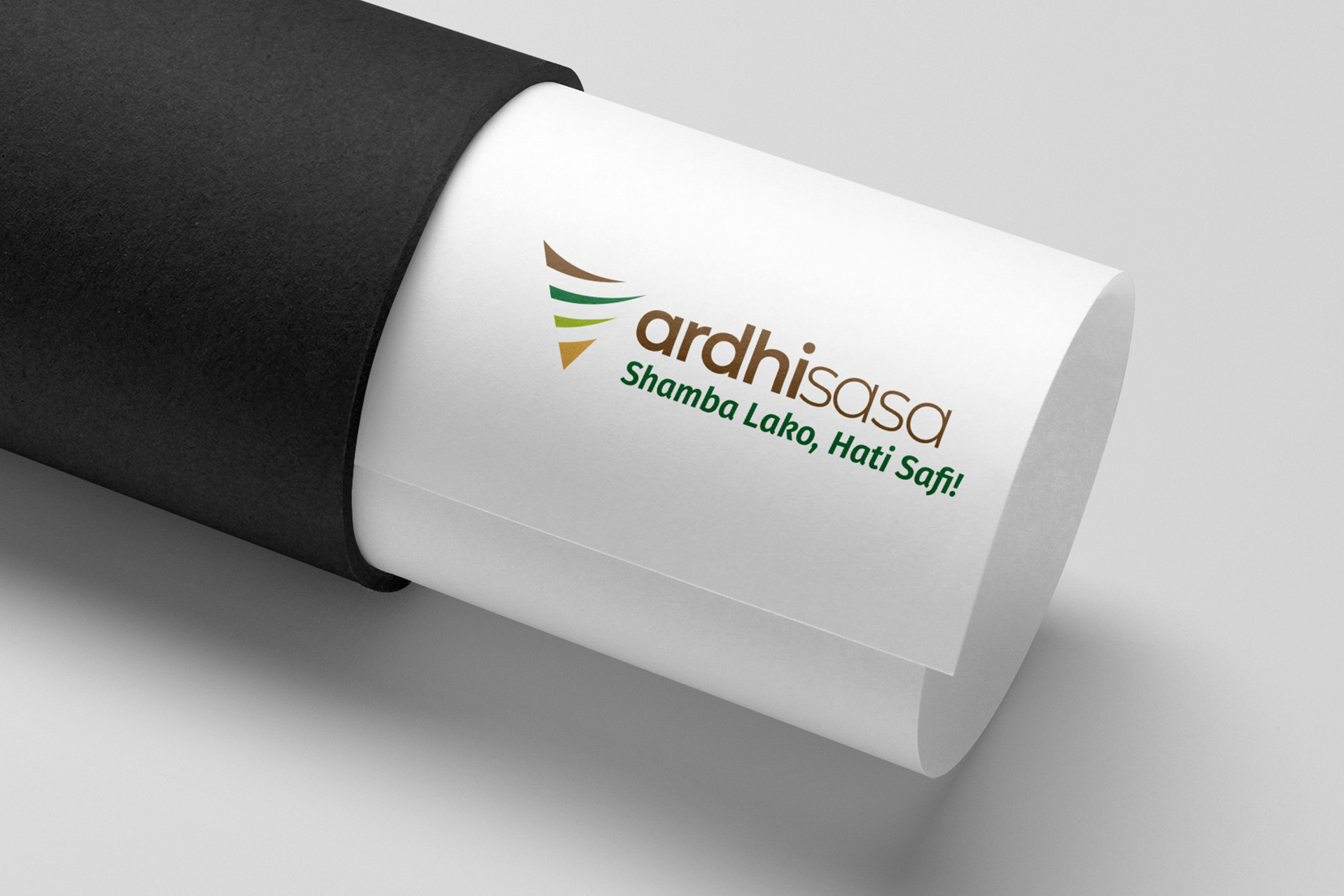
THE ARDHISASA DIGITAL LAND MANAGEMENT SYSTEM LOGO DESIGN
Client: Kenya Ministry of Lands and Physical Planning
Ardhisasa is an online platform that allows Citizens, other stakeholders and interested parties to interact with land information held and processes undertaken by Government. It has been developed jointly by the Ministry of Lands and Physical Planning (MoLPP) and the National Land Commission (NLC) and key partners in Government.
This logo also uses the letter A as its key symbol. Within the letter A we have incorporated curved lines that are a symbol to illustrate a landscape. The letter A in this logo is also presented facing downwards to symbolize the download button. This is to illustrate the online process. This logo also uses colours from the Ministry's colour pallete.
-
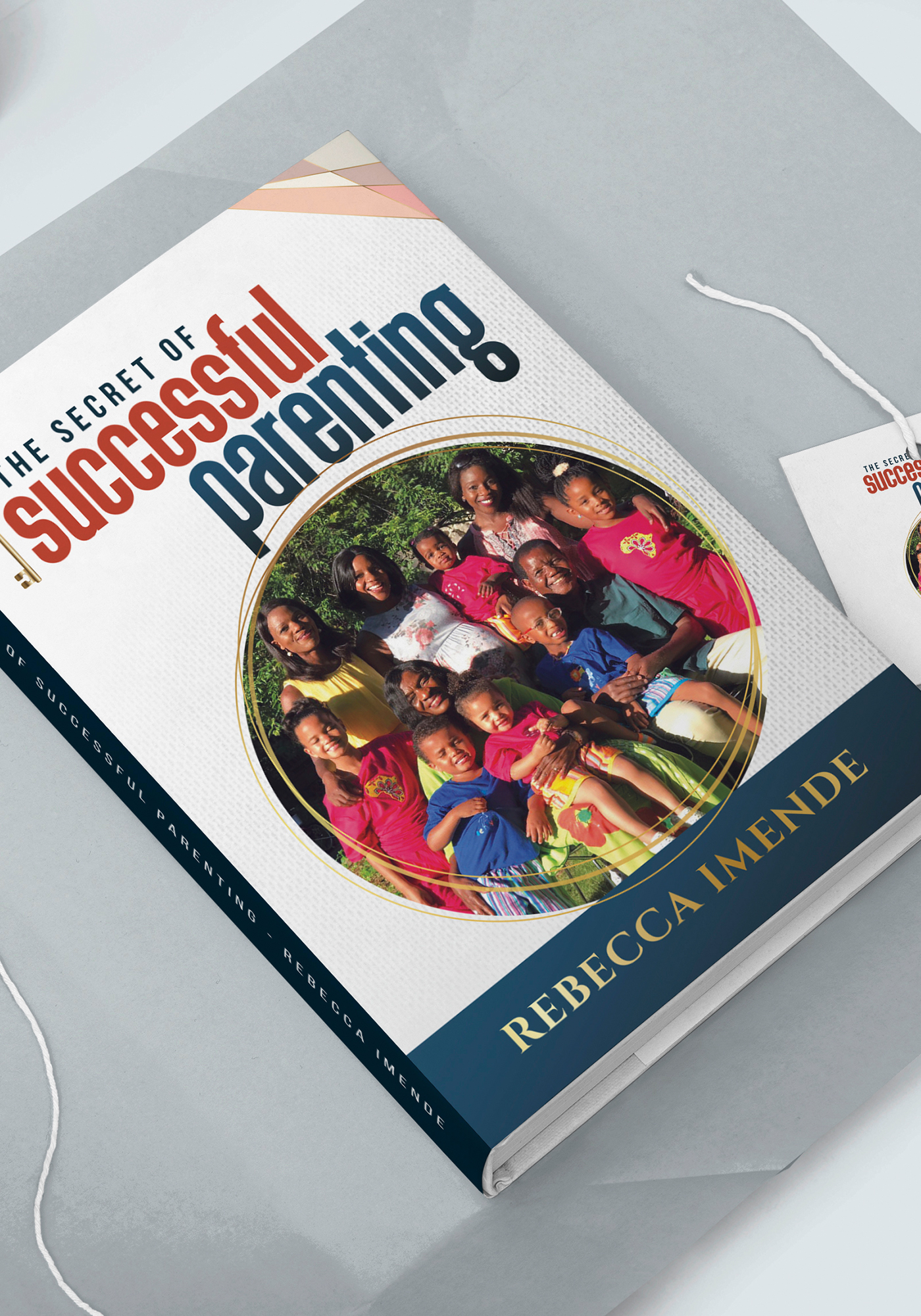
PARENTING BOOK
Client: Snr. Pastor Becky - New Hope Outreach Ministries
After having volunteered on so many church projects, my home pastor asked if I can help her work on her personal book that talks about the secrets of succesful parenting.
This was a very rewarding project. She was delighted by the outcome of her book and in her words - she said "it looks so international!" :).
-
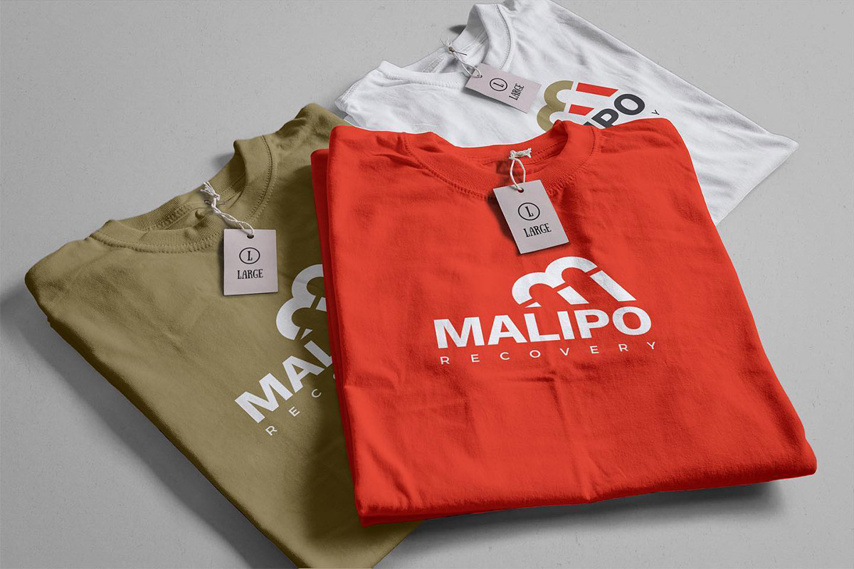
MALIPO RECOVERY
Client: Apollo Agriculture
Malipo recovery, from Apollo Agriculture is an app that facilitates the recovering debt. Malipo recovery offers debt collection services associated with loans or credit provided through platforms that use the Malipo system.
-
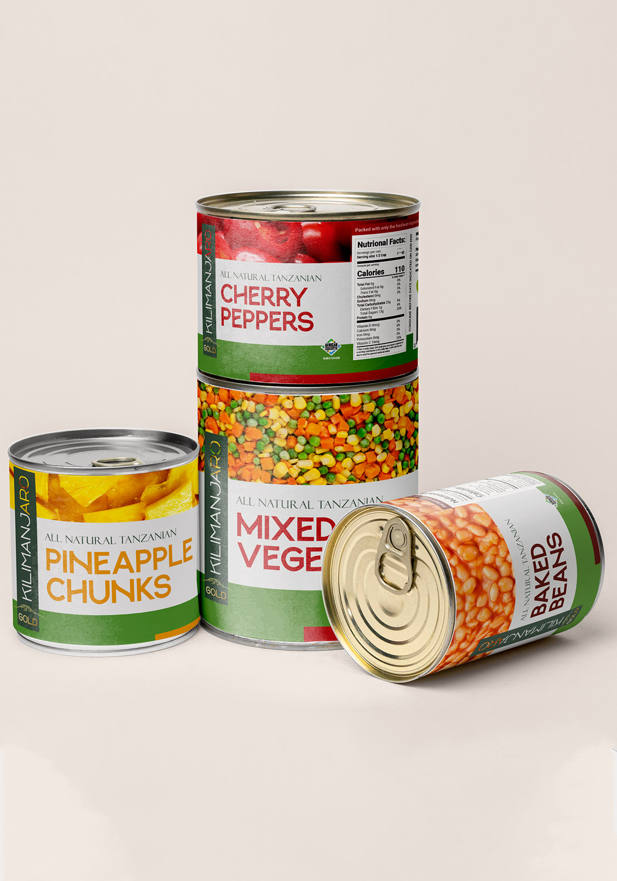
AFRICAN VEGETABLES LIMITED
Client: African Vegetables Limited - TZ
African Vegetables Company Ltd. (AVL) is a canning factory and farm in Moshi, Tanzania, owned by Dutch holding JAMAEL Food Group. AVL produces green beans in glass jars and export them to Europe via our sister company Baltussen in the Netherlands. AVL's mission is to sustainably produce export-level quality food in Tanzania and provide local and regional access to the same standards. The company believes that value addition through food processing, thereby preserving nutrients and enhancing shelf life, will be a key contributing factor in improving export and local market offering.
Besides canning, AVL produces fresh produce for export. For the longer term, the company is exploring other canned goods for export as well as bringing suitable canned goods to the local and regional market.
-
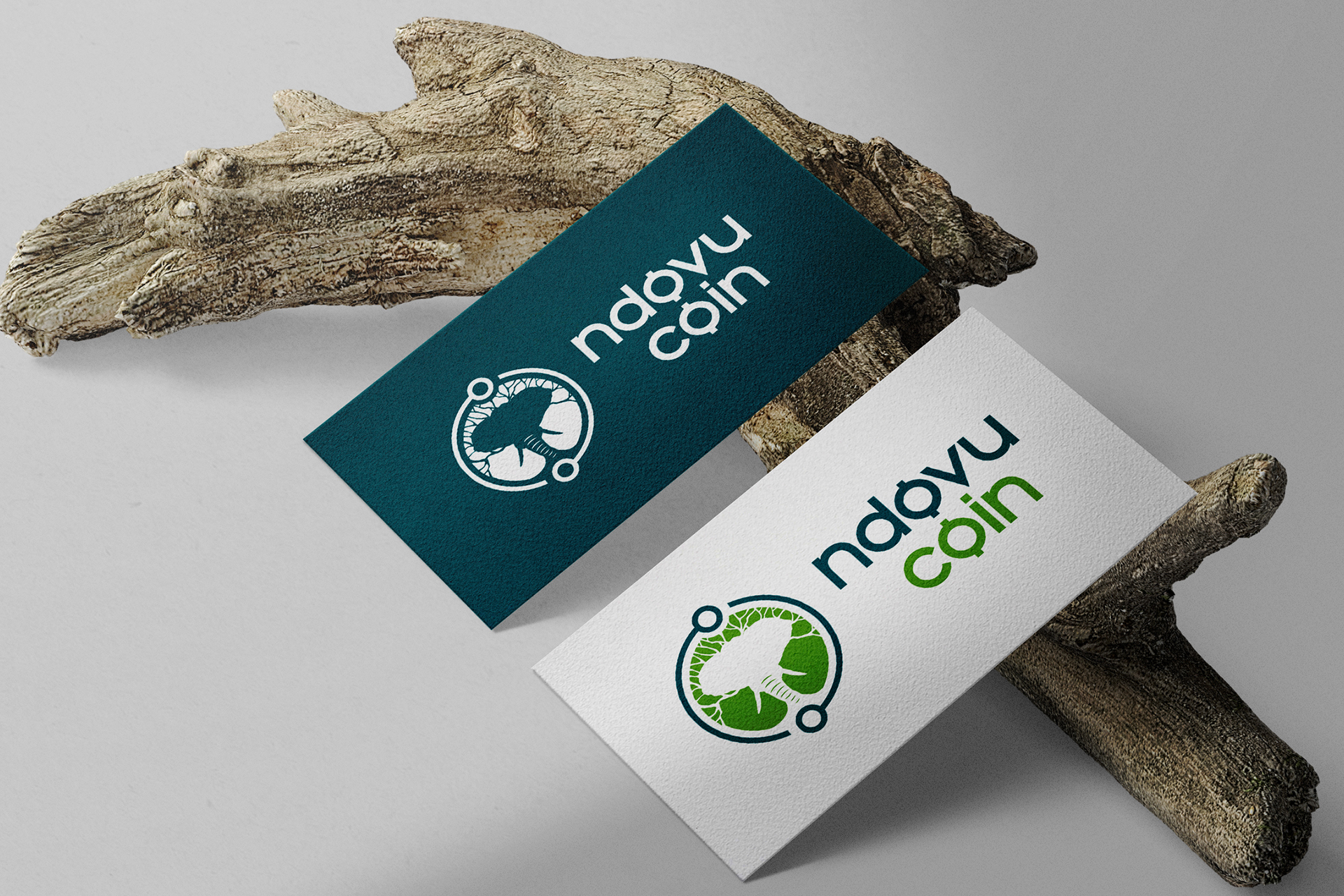
NDOVU COIN DIGITAL CURRENCY lOGO DESIGN
Client: NdovuCoin LLC
A Real world solution for a real world problem.
NdovuCoin LLC advances Ecological conservation using block chain technology by creating a cryptocurrency called NdovuCoin to help raise funds from all channels (friends, grants, family, individuals, companies) managed by an appointed conservation council to go into conservation projects and activities.
NdovuCoin LLC targets a global audience as it is a cryptocurrency based platform for people with interest in supporting conservation projects as well as technologically savvy individuals to use emerging technology such as block chain and cryptocurrency.
This simple, minimal logo uses the head of an elephant, a tree trunk and the shape of a coin to create a simple unique logo mark. The tree trunk is infused into the elephants trunk to symbolize the vision of NdovuCoin. The circle around this illustration is designed in the form of a circuit network to symbolize technology and forms the symbol of a coin bringing together the NdovuCoin symbolism while also tieing the composition together. The inter-relationship between the symbols in our logo aims to mimic the symbiotic relationship between NdovuCoin and its stakeholders.
-
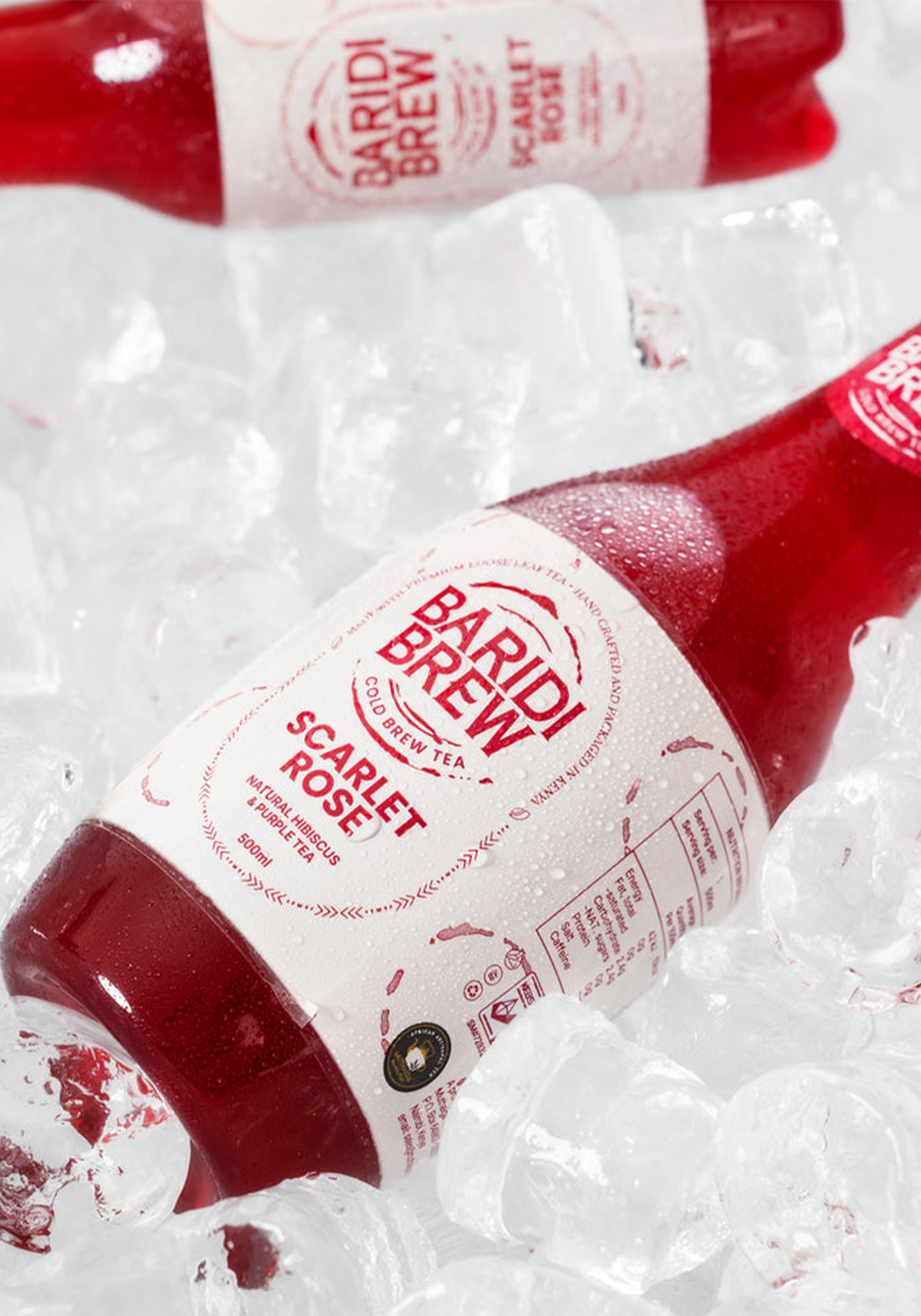
BARIDI BREW
Client: Muthaiga Tea Company
Introducing Baridi Brew (Fondly referred to as BB by the creative crew 😉)
BB branding is all about translating natural ingredients, wellness, and conscious consumption into vibrant, ready-to-drink cold brew brands that feel modern yet grounded. This visual system captures the essence of each blend; Coco Rain, Scarlet Rose, Kijani Dawa & Rwanda Noir, while keeping things natural and minimal with no distractions,… just clean design inspired by clean ingredients. Chack out BB at: www.baridibrew.co.ke -
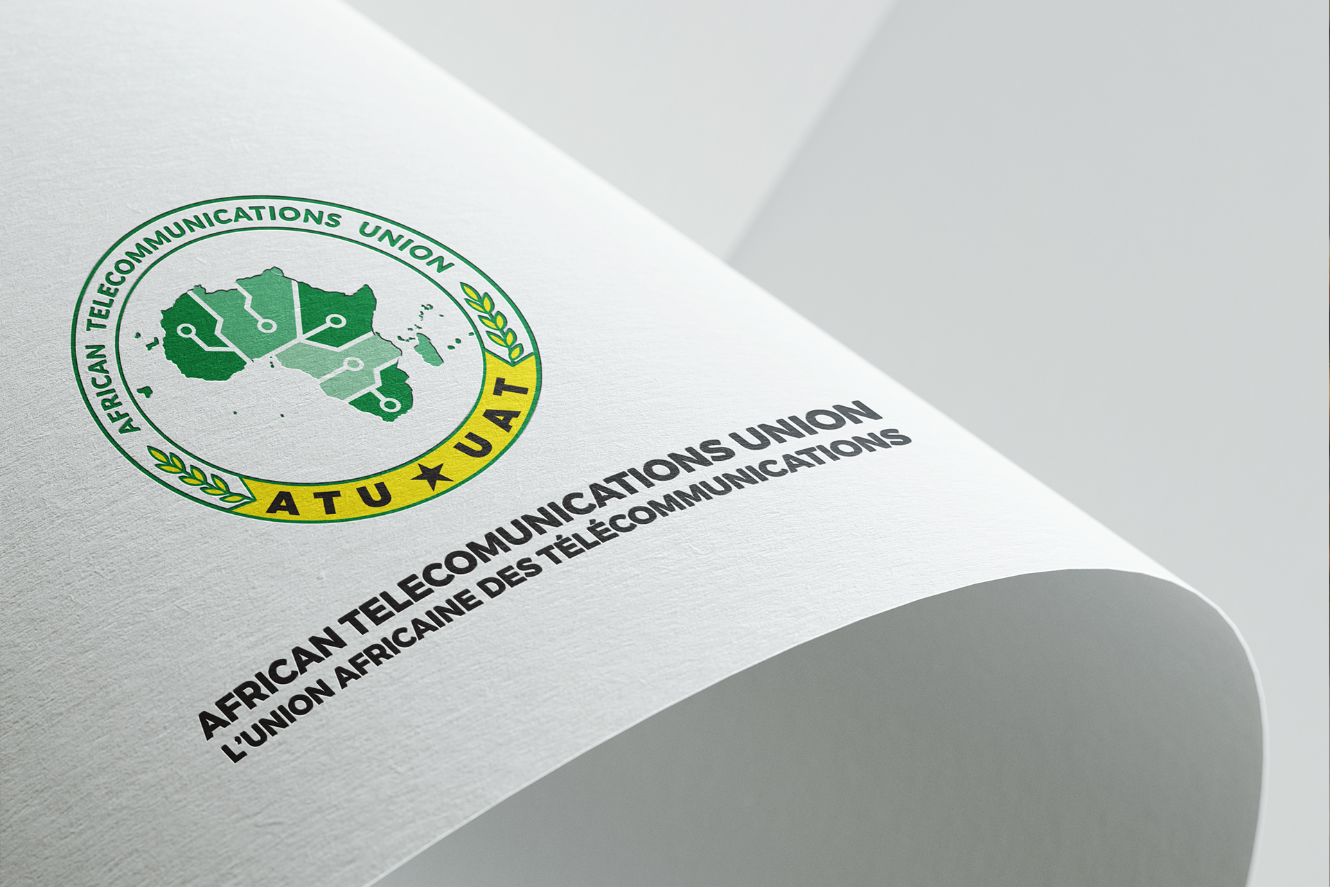
THE AFRICAN TELECOMMUNICATIONS UNION REBRANDING EXCERSICE
Client: The African Telecommunications Union
Established on December 7th, 1999, the African Telecommunications Union is the leading continental organisation fostering the development of information and communication technologies infrastructure and services.
The mission of the Union is to promote the rapid development of infocommunications in Africa in order to achieve universal access, and full inter-country connectivity.
The Union envisions an Africa that is empowered as a full and active participant in the global information and knowledge society.
ATU currently has 44 Member States and 16 Associate Members (comprising fixed and mobile telecom operators).ATU provides a forum for stakeholders involved in ICT to formulate effective policies and strategies aimed at improving access to information infrastructure and services. In addition, the Union represents the interests of its members at global decision-making conferences and promotes initiatives aimed at integrating regional markets, attracting investment into ICT infrastructure, and building institutional and human capacity.
The Re-brand
The original ATU emblem that has been in use since the establishment of the Union, contains the satellite earth station dish. It was relevant at the time given the focus of the Union on matters of telecommunications. However, over time, the change of the ICT landscape and the diversification of services available, including mobile telephony, broadband, Internet, etc, necessitates the change in the symbols and signs used by the Union in its physical brand assets. This forms the basis of the development of a new ATU emblem that is representative of the changing environment and the role of the Union.
-
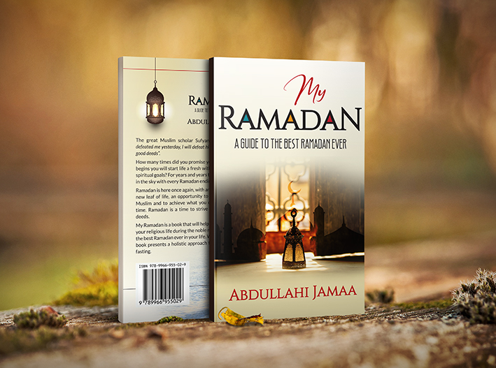
MY RAMADAN BOOK
Client: Abdulahhi Jamaa
-
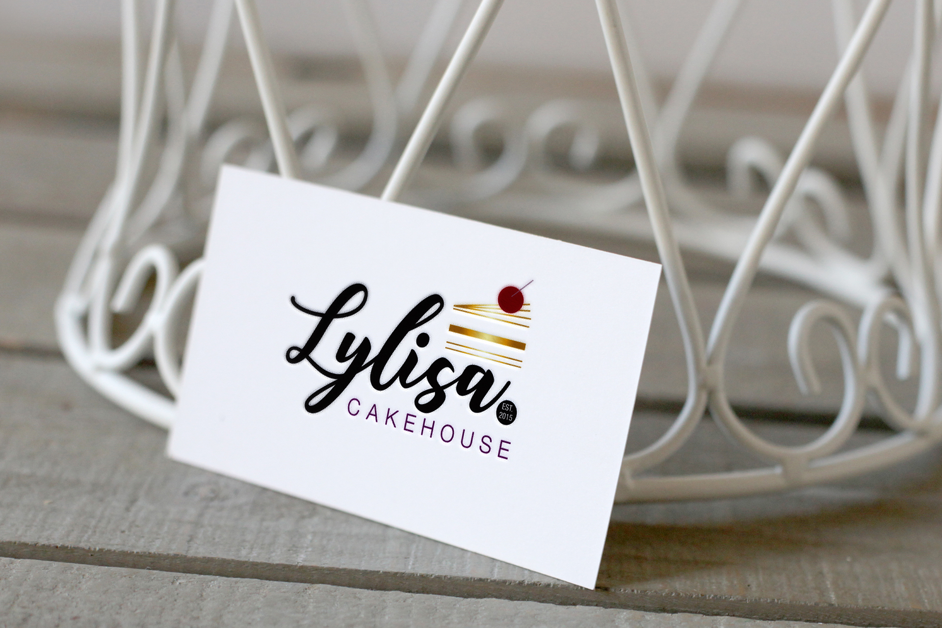
LYLISA CAKEHOUSE LOGO DESIGN
Client: Lylisa Cakehouse
-
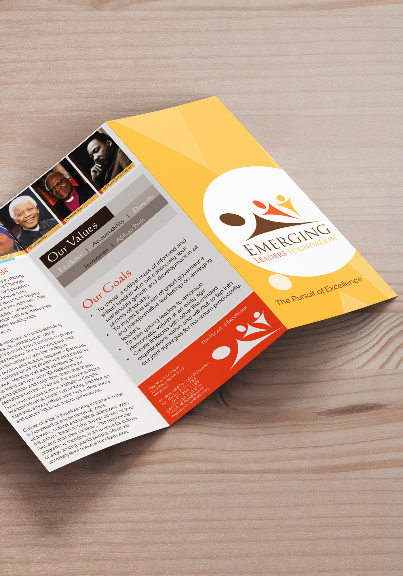
EMERGING LEADERS FOUNDATION BROCHUR DESIGN
Client: Emerging Leaders Foundation
-
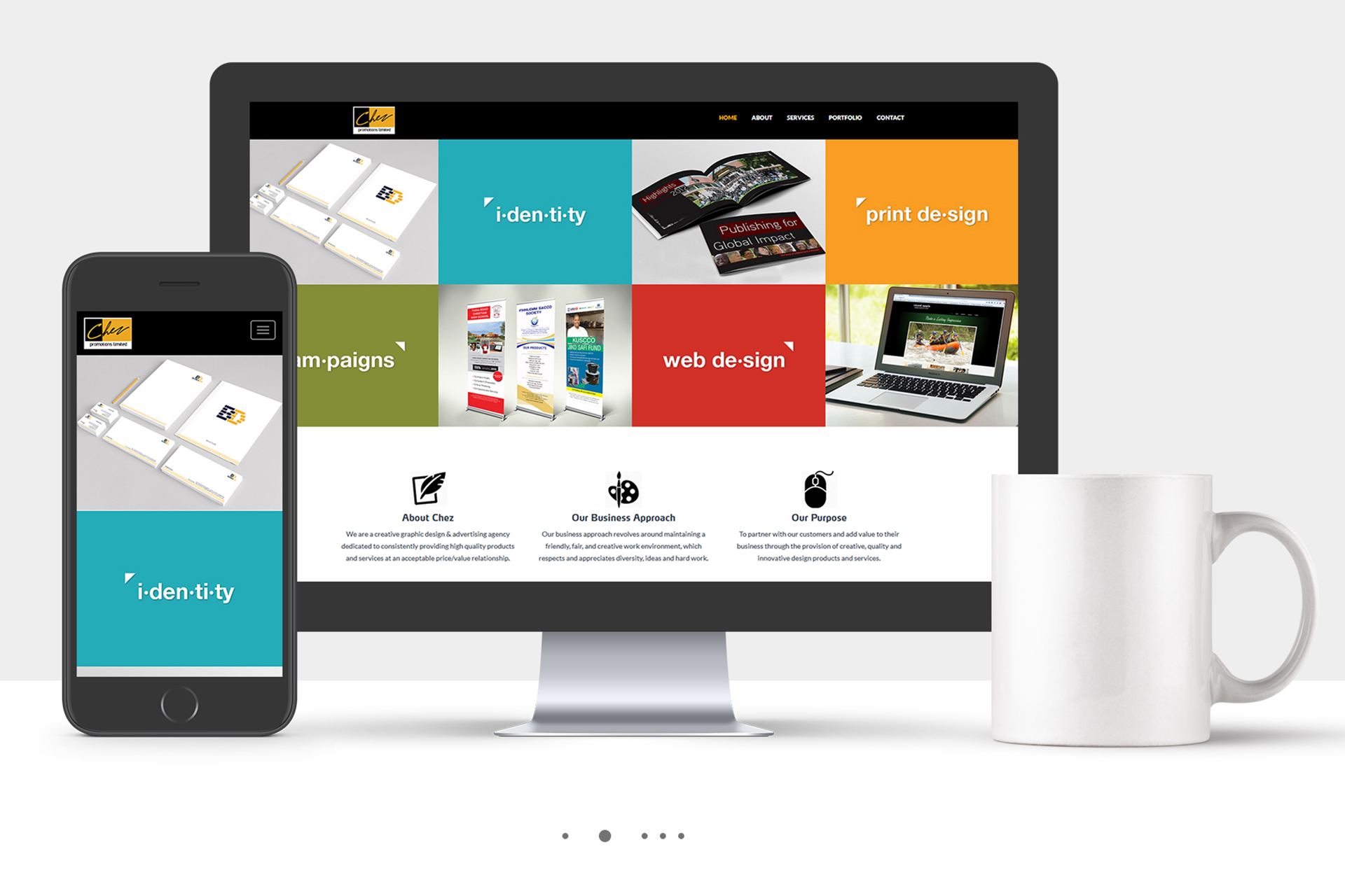
ChEZ PROMOTIONS LIMITED WEBSITE DESIGN ROJECT
Client: Chez promotions Limited
-
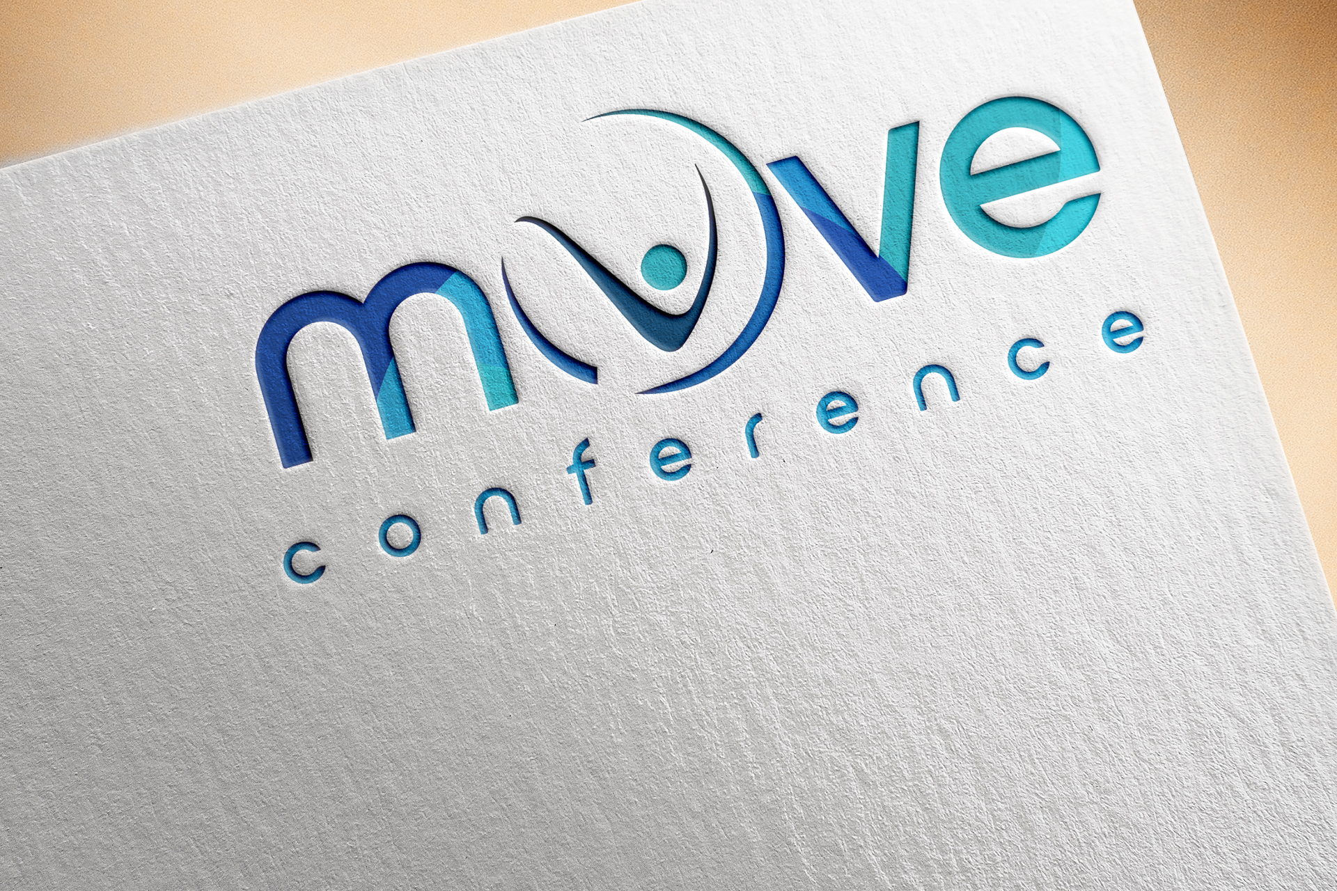
THE MOVE CONFERENCE lOGO DESIGN
Client: The Wisdom Sunctuary Church
-
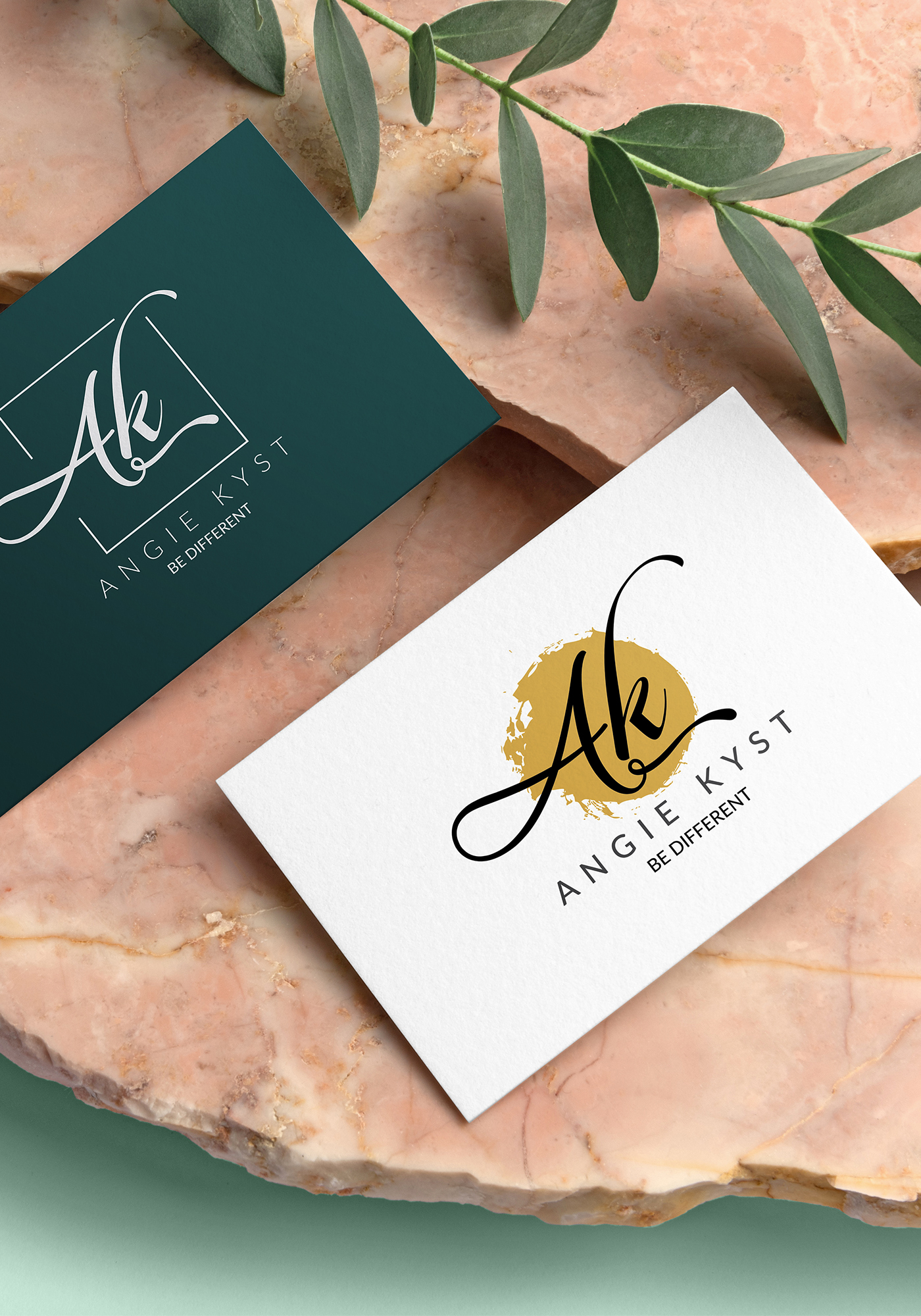
ANGIE KYST BRANDING
Client: Angie
Angie is a jewellery designer base in Naiobi, Kenya.
-
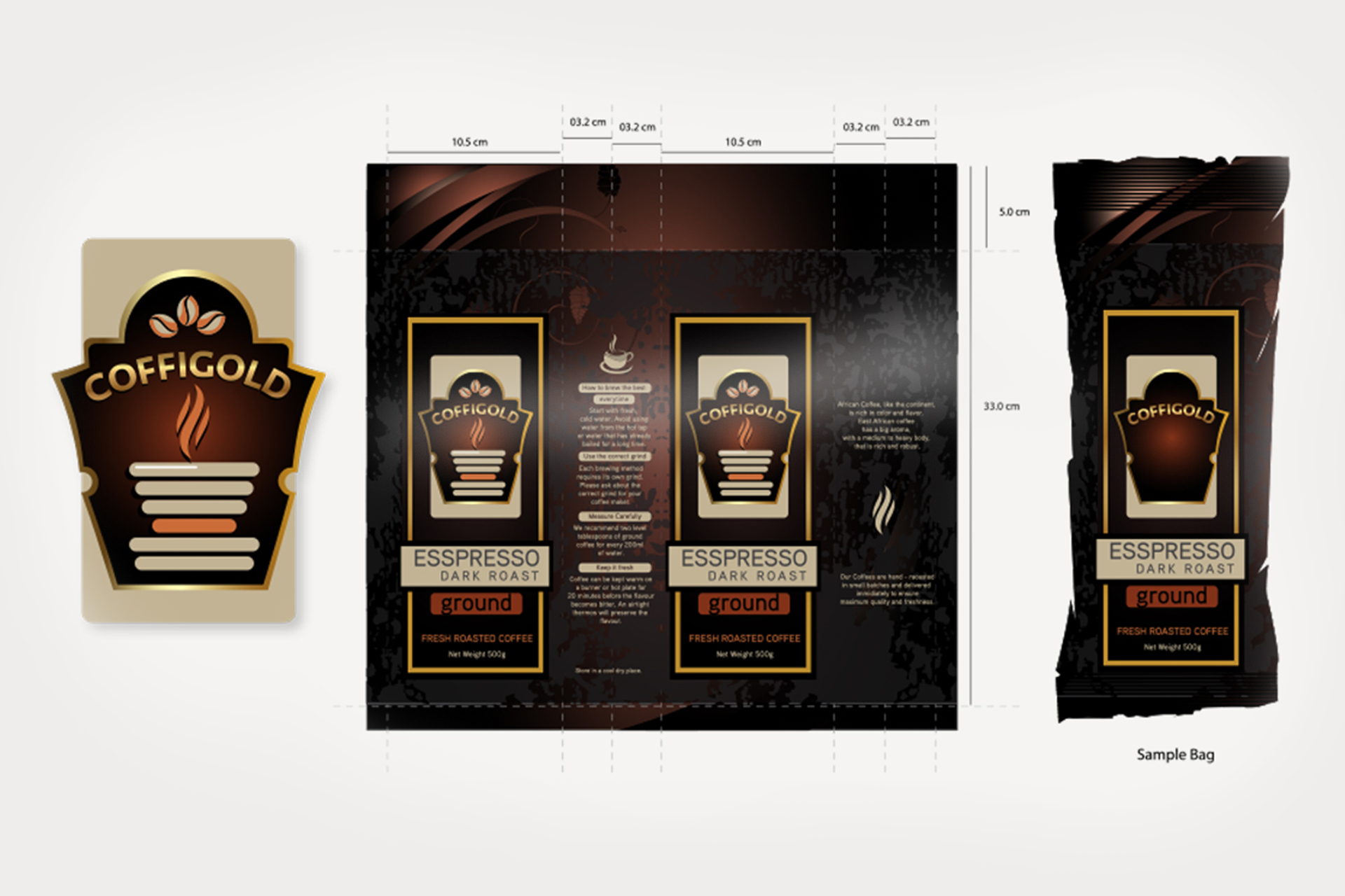
COFFEE GOLD PACKAGING
Client: The Olive Marketing & Publishing Co.
-
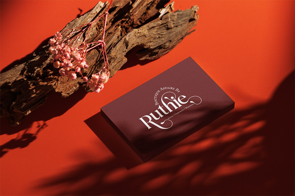
BABR LOGO
Client: Boutique Affairs by Ruthiee
Boutique Affairs by Ruthie is a high end consultancy that plans, designs & executes boutique social & corporate events.
-
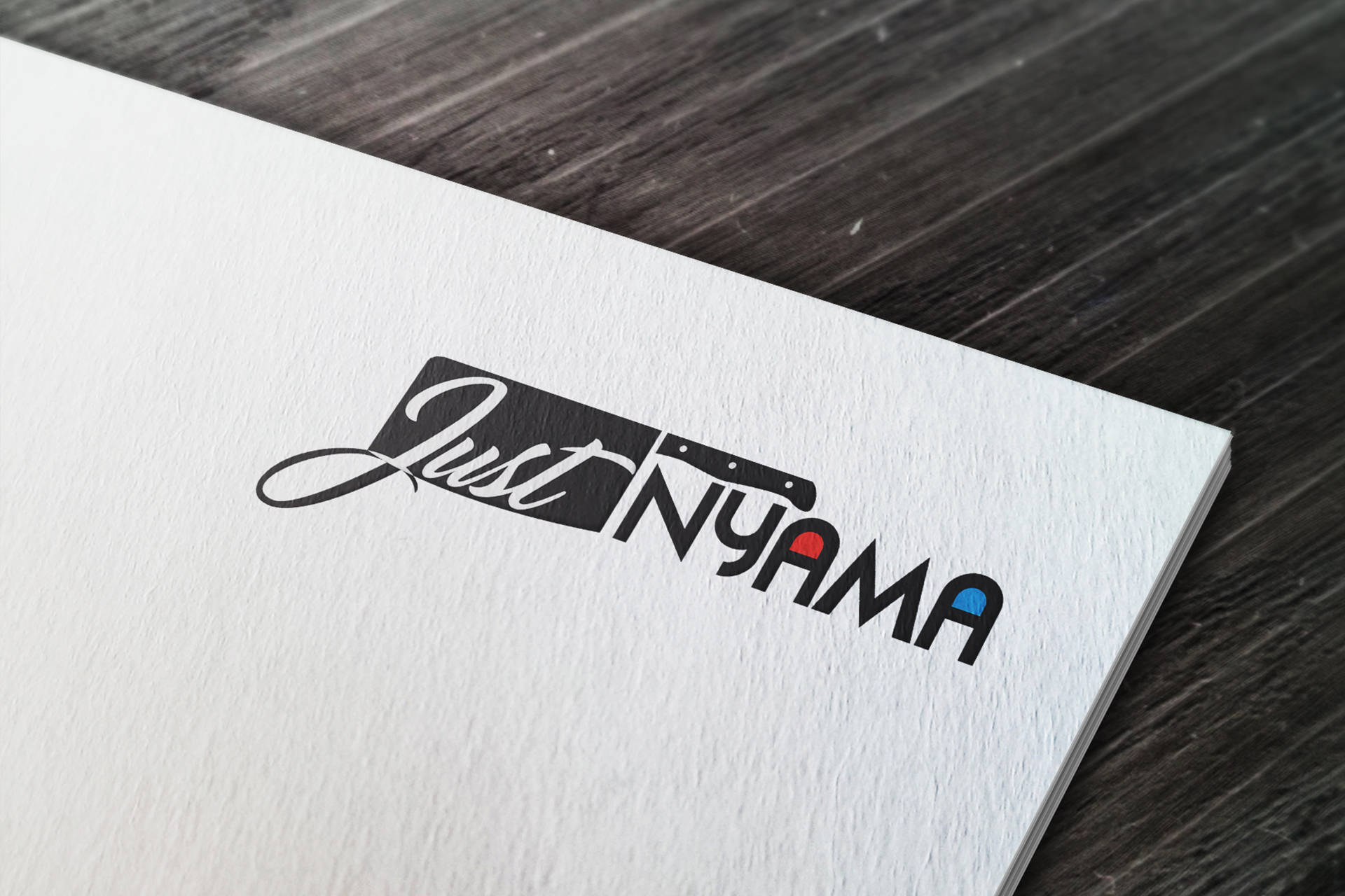
JUST NYAMA
Client: Just Nyama Butchery
-
SEMA LOGO DESIGN
Client: SEMA Foundation via Impact Africa Limited
The SEMA logo is modern, youthful, symbolic and full of life. The logo uses the sun and quotation speech marks (‘ )as its major symbolism. The speech marks symbolize conversations between the adolescents and other members of society.
The logo uses vibrant colours to make it lively and youthful to symbolize ‘youth’. The diverse colours used in our logo represent the various needs/issues affecting the adolescents and the ‘bridge’ under the sun symbol shows the organizations’ intention to act as a bridge between the adolescents and other members of society.
-
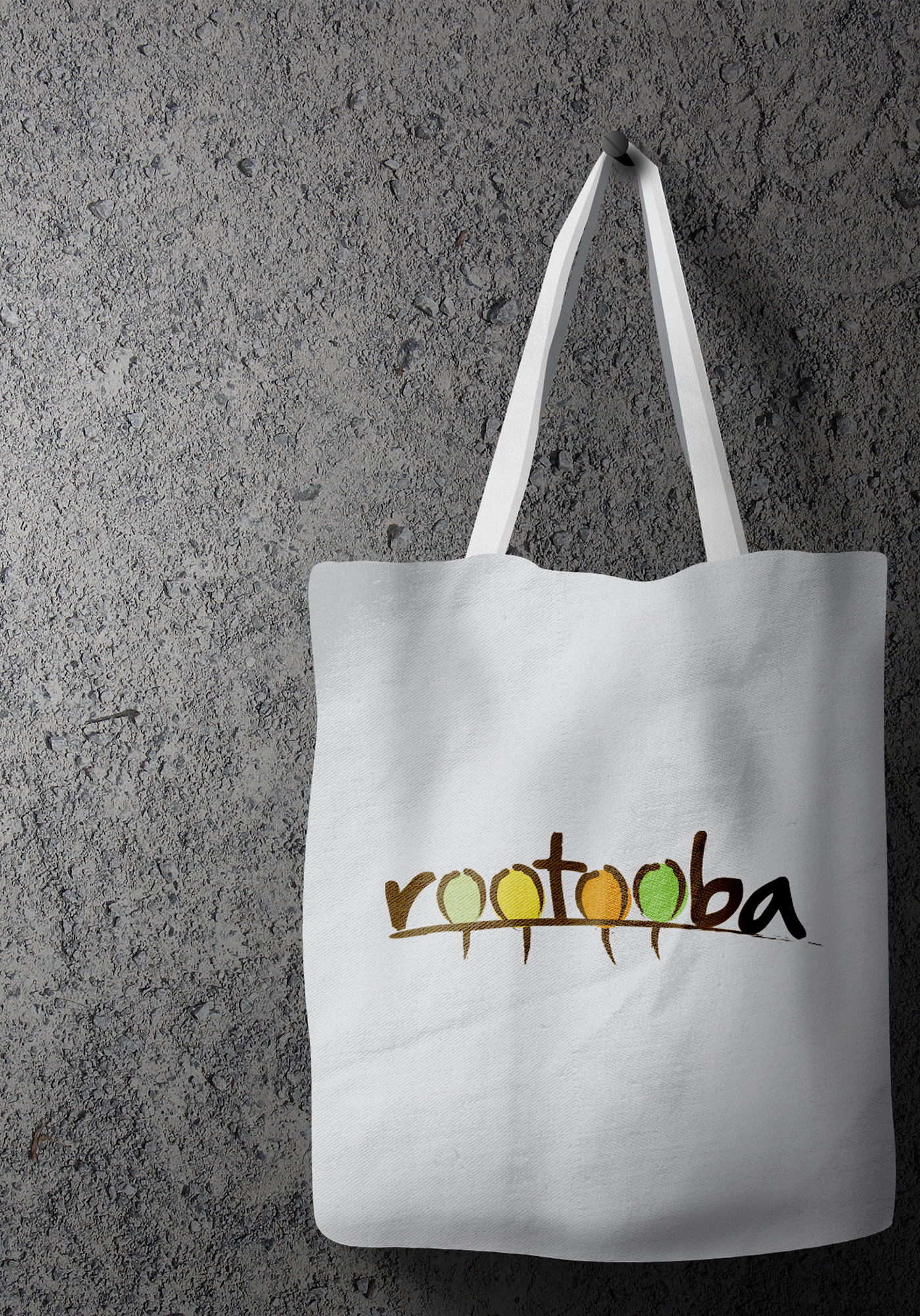
ROOTOOBA LOGO DESIGN
Client: Rootooba Limited
The Rootooba logo uses the company word-mark rootooba for its primary symbolism. The word roootooba is coined from the swahili word 'rotuba' which means fertility. With fertility comes life and vibrancy, which is what the oranization envisions for the agricultural sector.
The swoosh across the word-mark symbolizes the ground level and the projections below it to symbolize roots - which show that the organization seeks to handle challenges from the 'root' based on their in-depth understanding of the entire agricultural value chain, thus setting a fertile base for solutions to a rich & vibrand sector. -
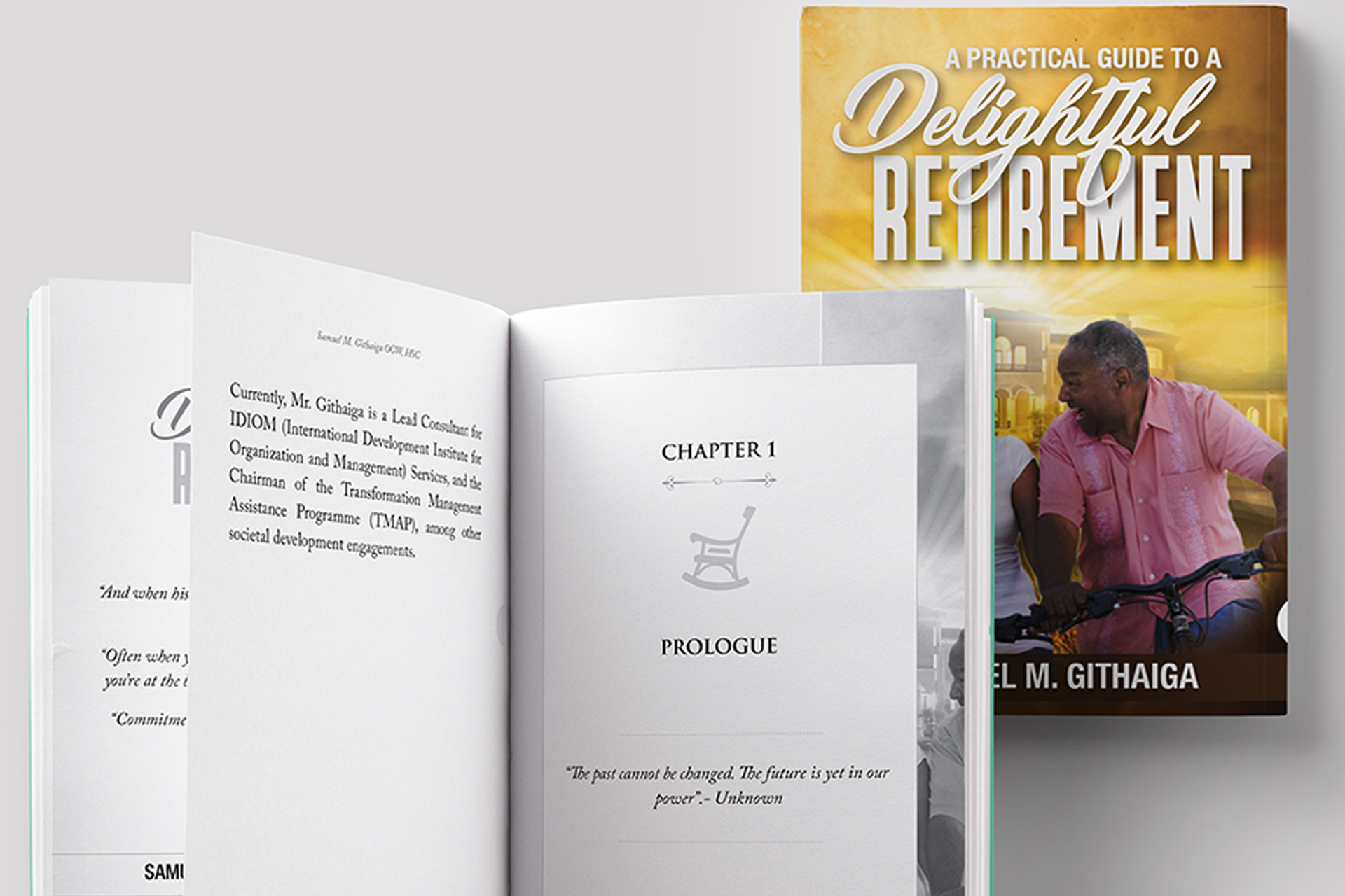
RETIREMENT BOOK LAYOUT
Client: Samuel Githaiga
-
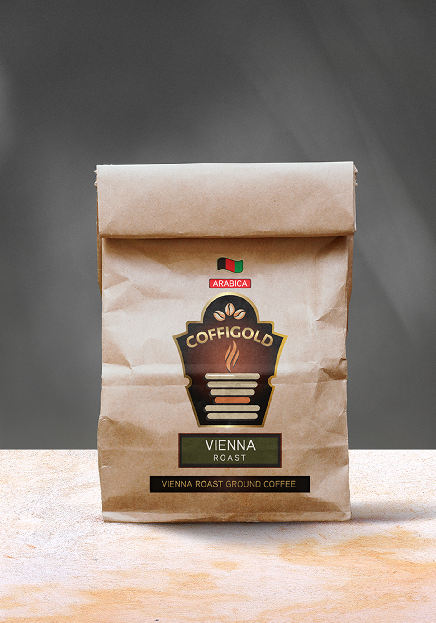
COFFIGOLD PACKAGING DESIGN
Client: The Olive Marketing & Publishing Company
-
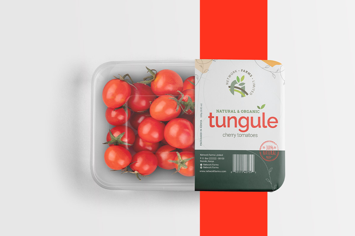
NFL PACKAGING
Client: The Network Farms Limited
The Network Farms Limited is a super brand that is the parent identity for various farm products including cherry tomatoes, chia, capsicum, among others that the farm packages.
-
CUSTOM WORDART DECOR
Client: 'Personal project".
As I venture into the delicate business of home graphic design decor. I will create/recreate custom word-art for your home.
-
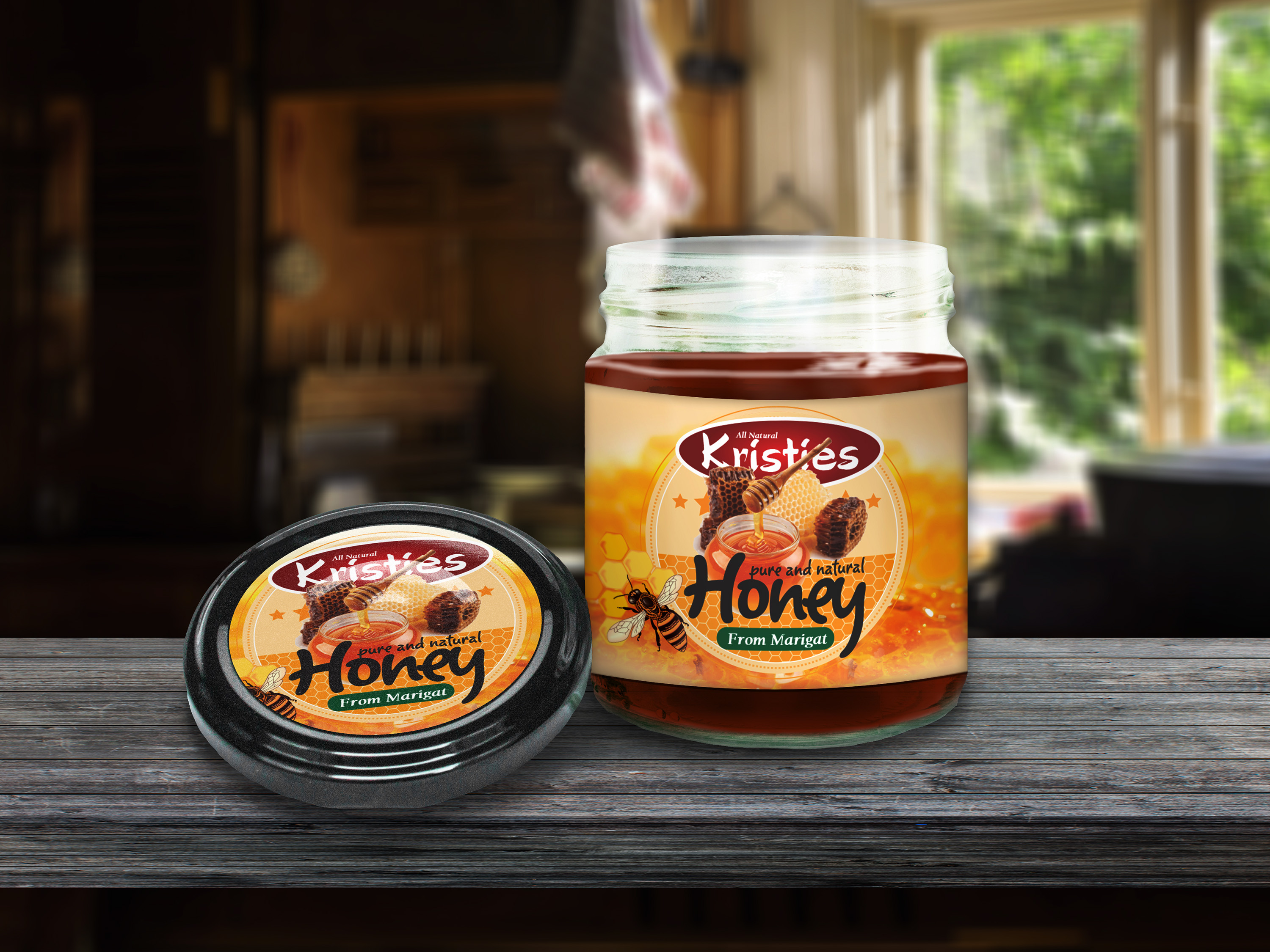
HONEY LABEL
Client: 'Kristies'.
I help small start-ups have premium packaging, without the premium price tag.
-
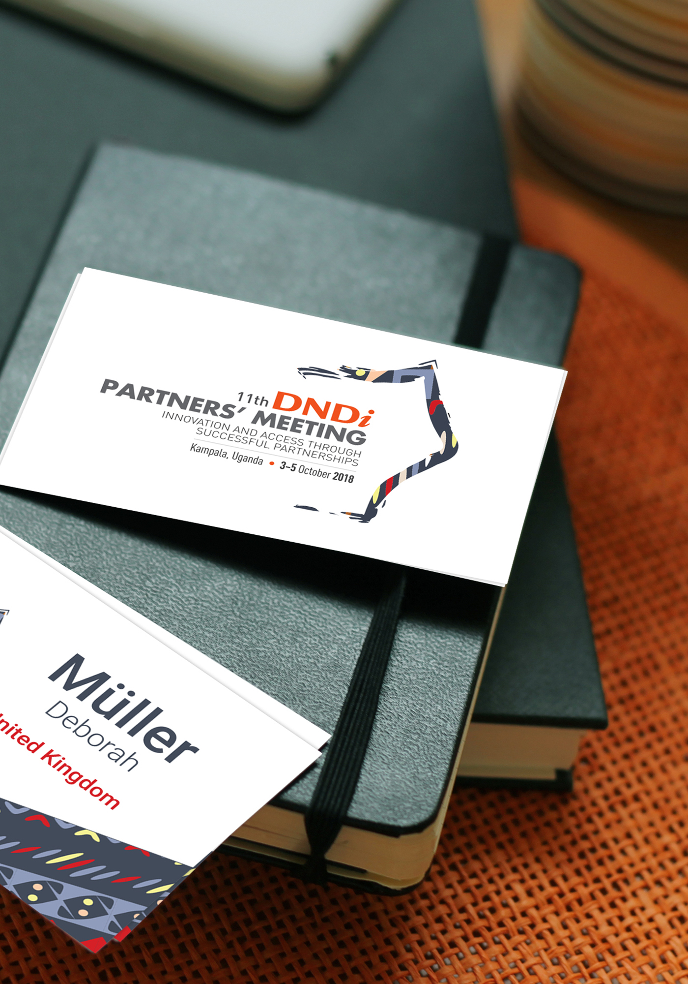
THE DNDi CONFERENCE BRANDING
Client: 'DNDi _via Chez promotions Limited.
The 11th DNDi Partners Meeting logo was inspired by the map of Uganda and the colours of the Ugandan national bird - the crested crane. Along the right edge of the logo, you can see the contours of Uganda’s northern, eastern and southern borders created using a brush stroke. The colours and pattern in the brush stroke represent the many different partners and countries that came together in Uganda for the meeting.
-
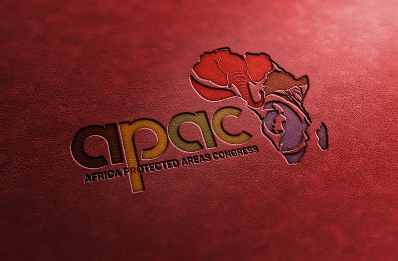
THE APAC CONGRESS BRANDING
Client: Impact Africa
The APAC (Africa Protected Areas) Congress is the first ever continent-wide gathering of African leaders, citizens, and interest groups to discuss the role of protected areas in conserving nature and promoting sustainable development.
The APAC logo is packed with symbolism. The logo aims to highlight the various aspects that need protection, including; wildlife, vegetation, water bodies, Africa’s rich cultural heritage and traditions. The vibrant Logo primarily uses African Colours and aims to be warm, friendly and interactive. The colours of the Logo are symbolic with green symbolizing vegetation, red ocre symbolizing wildlife and blue symbolizing marine animals and water bodies.
The wildlife, vegetation and marine symbols within the logo come together within the African map to symbolize conversation/protection - being a key aim of the APAC congress. -
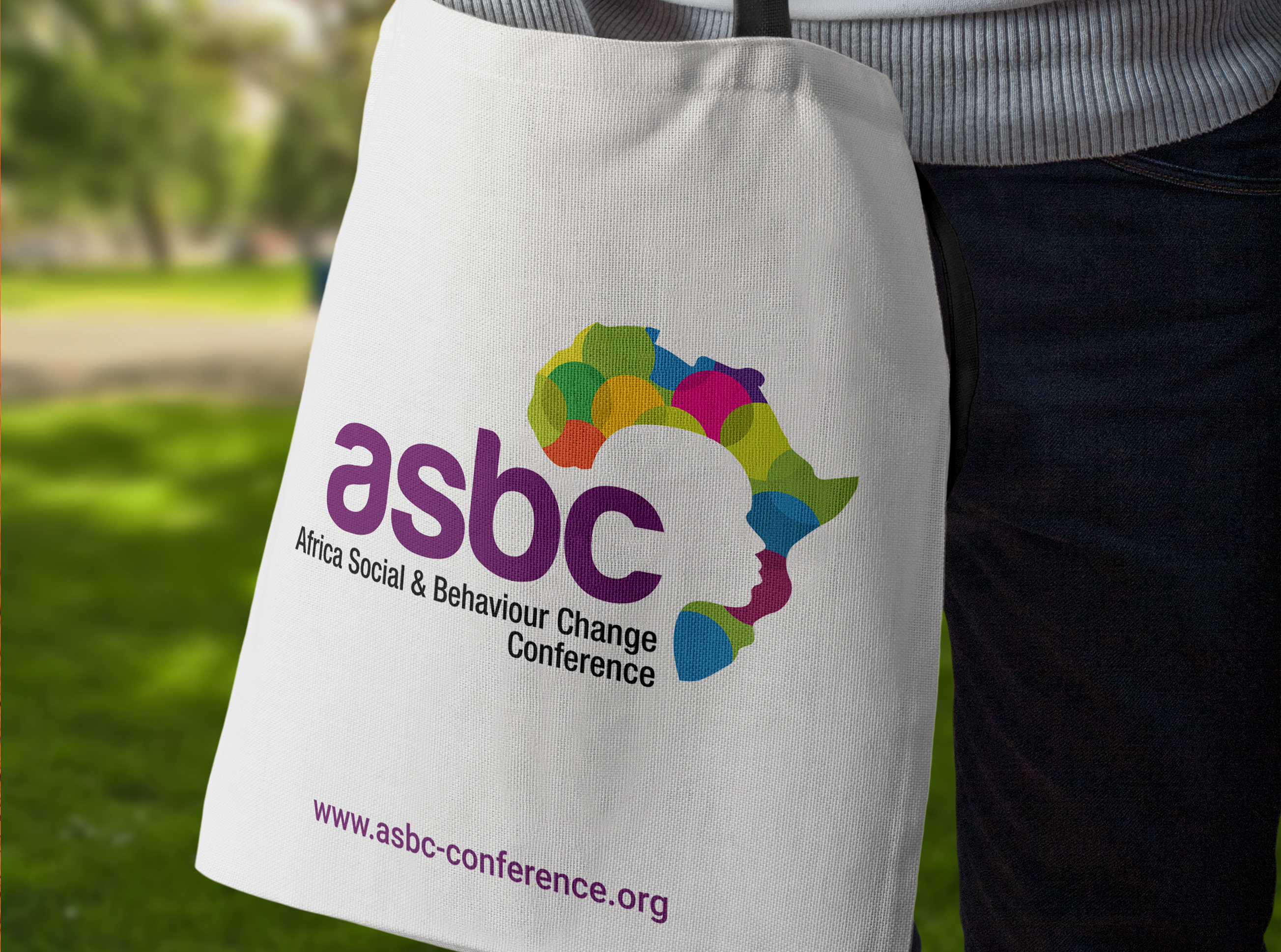
THE ASBC CONFERENCE BRANDING
Client: Impact Africa
The Africa Social behaviour Change conference, the first of its kind seeks to etsblish a platform that brings together practitioners and stakeholders to showcase theory, effective mechanisms, methodologies, learnings witin the African context.
The ASBC logo aims to potray in a very simple but vibrant way - behaviour change among the young people. The circles in the logo symbolize behaviour/character, the colour transitions within the circle symbolize change. These icons are packed within the African ma to symbolize Africa as the host continent.
-
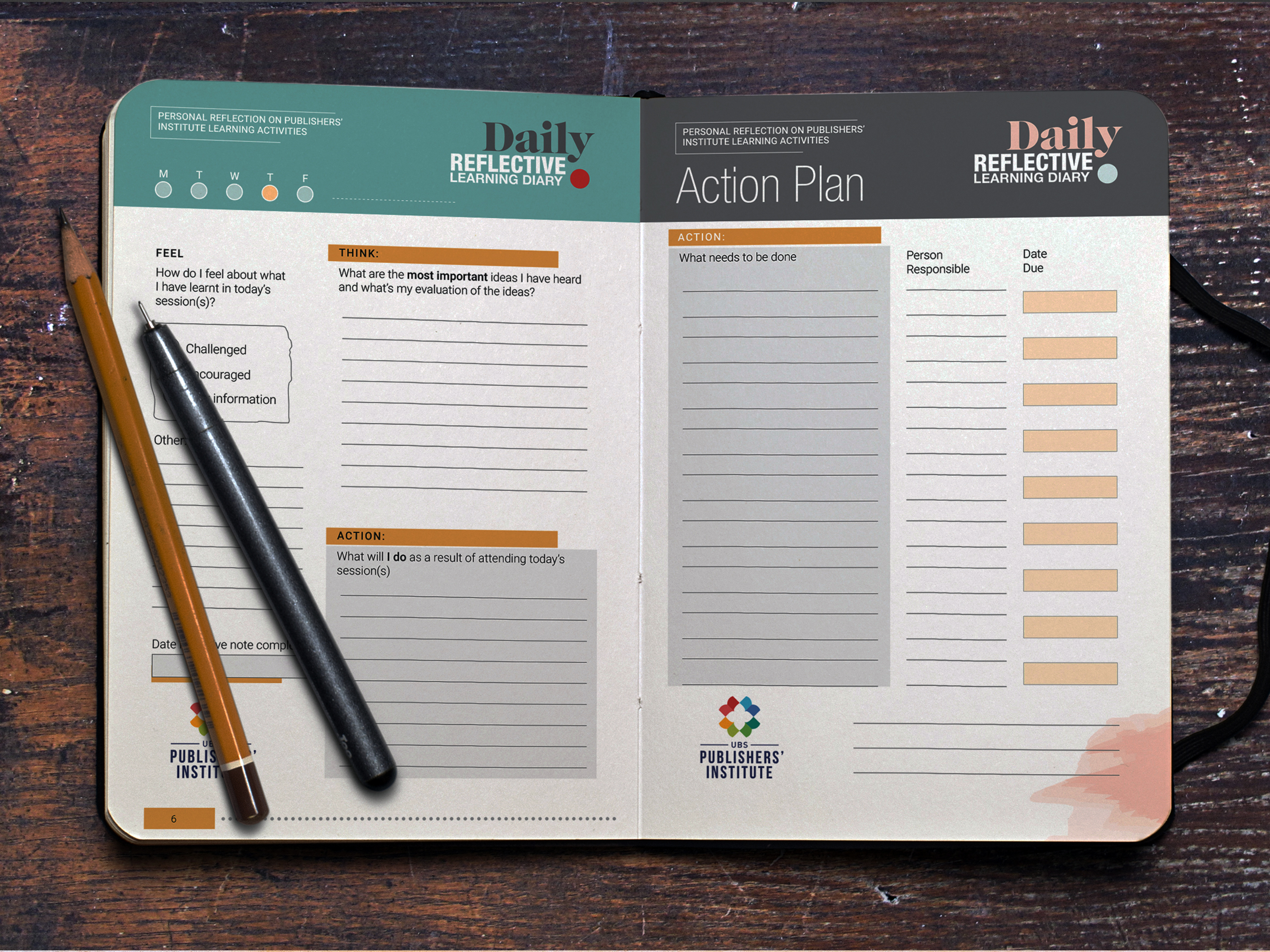
DAILY PLANNER DESIGN
Client: United Bible Societies
UBS is a christian organization that I work with under my current employment to develop branding material.
-
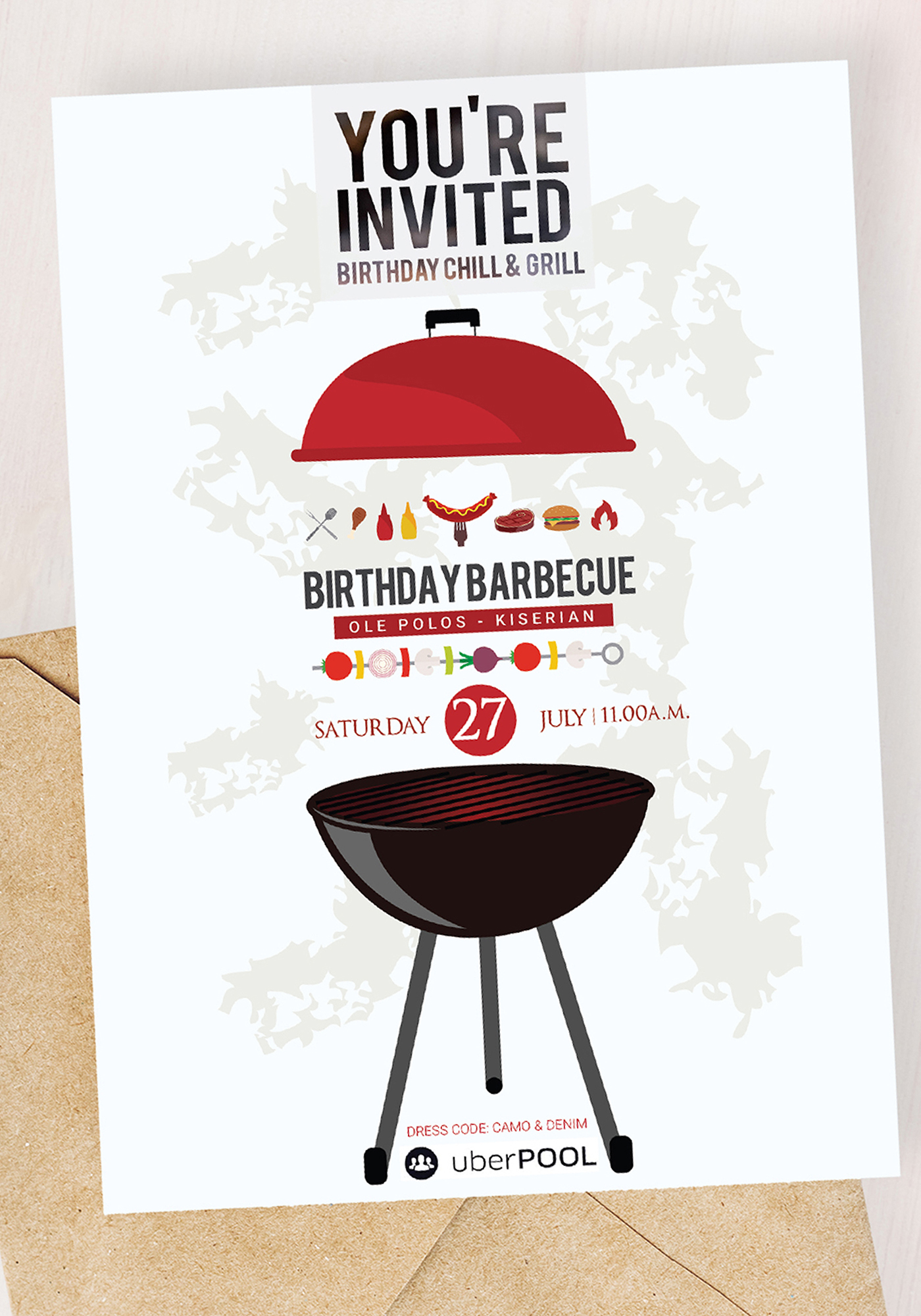
AMMA TITO BBQ INVITATION CARDS
Client: AmmA Tito
Invitation Design for a BBQ invite.
-
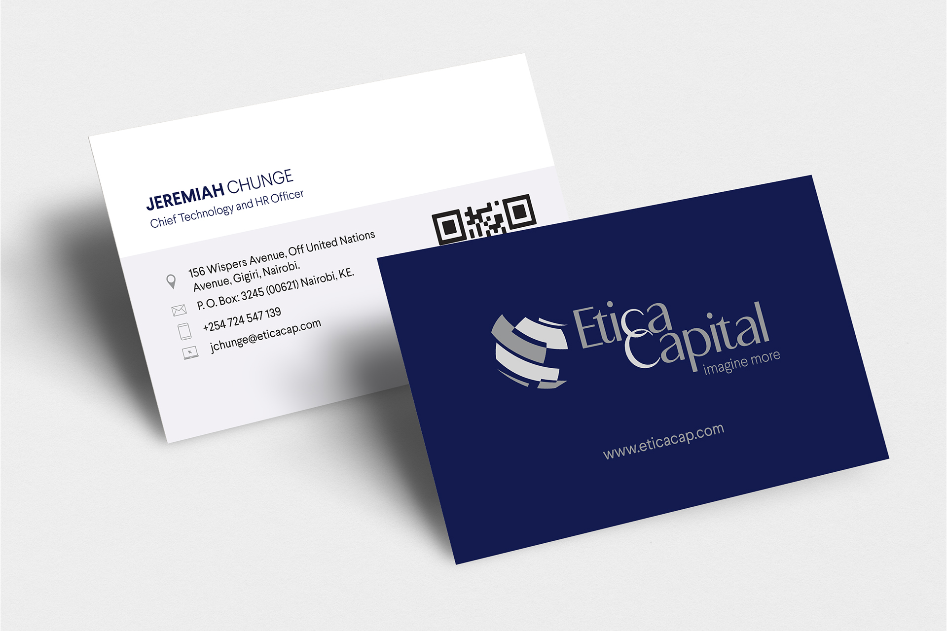
ETICA CAPITAL LOGO DESIGN
Client: Etica Capital
Logo Design for Etica Capital.
-
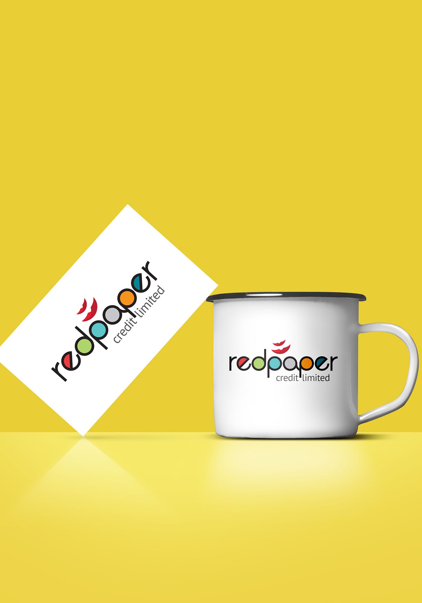
REDPAPER COMPANY LOGO DESIGN
Client: Redpaper Company Limited
AmmA Tito is a repeat client who is just obssesed by my branding! She has worked with me on various projects and continues to be a very happy client. This logo is designed for a lending business. My vision was to present the company in a friendly - non traditional way. I believe this removes the rigidity around borrowing/lending.
-
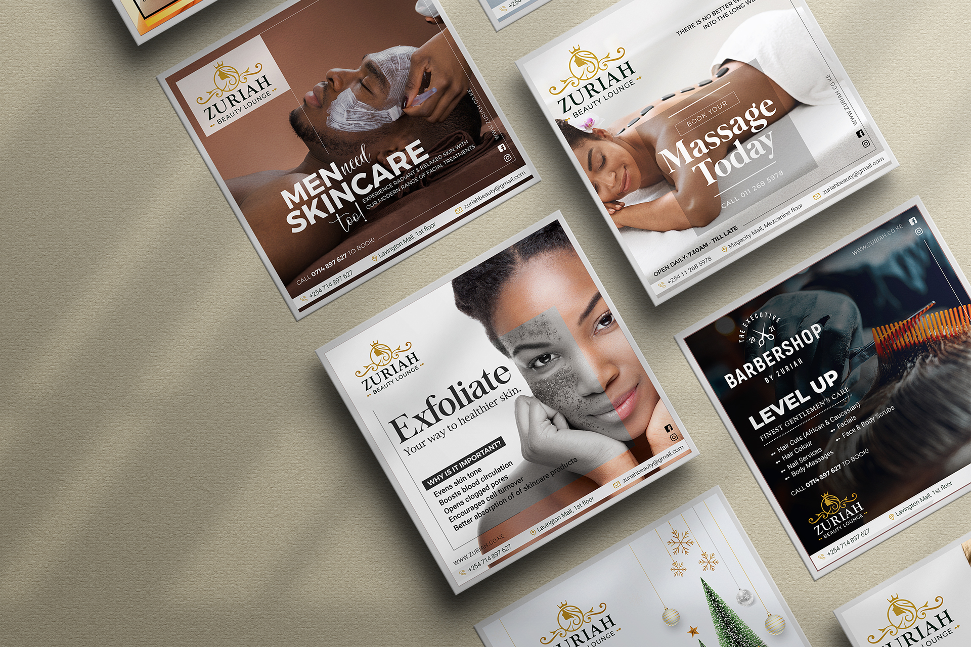
ZURIAH BEAUTY LOUNGE SOCIAL MEDIA CONTENT CREATION
Client: Zuriah Beauty Lounge
What does your social media content say about your business?
Running a business is hard enough, let us take care of your social media...
Talk to us about your business goals and let us help you develop meaningful, targeted content for your immediate and long term needs. We create content that is not only creative, but also targeted to drive sales and boost engagement.
Talk to us for customized scheduled content, content calendars, targeted messaging and posting schedules. -
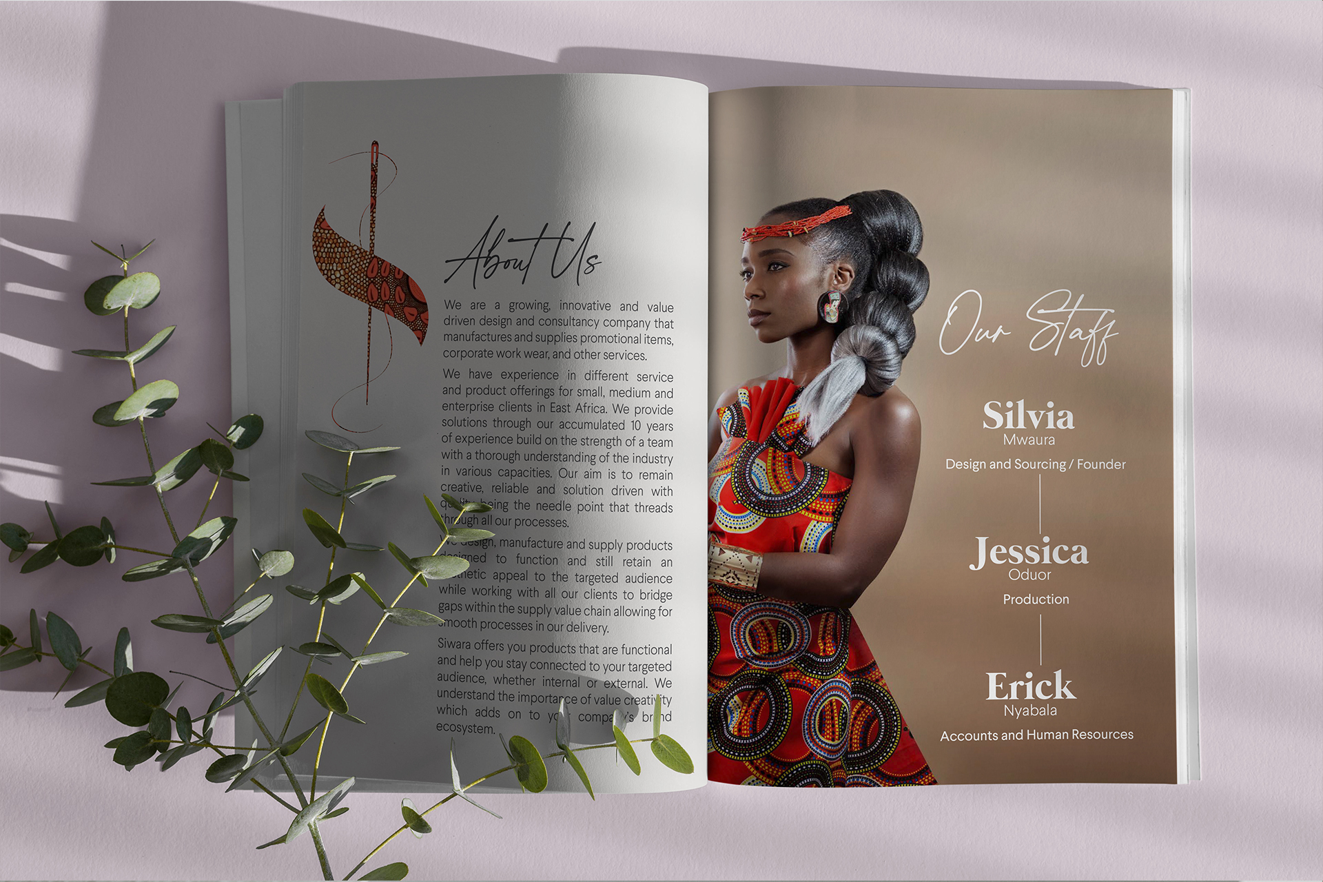
SIWARA COMPANY lOGO DESIGN
Client: Siwara Company Limited
-
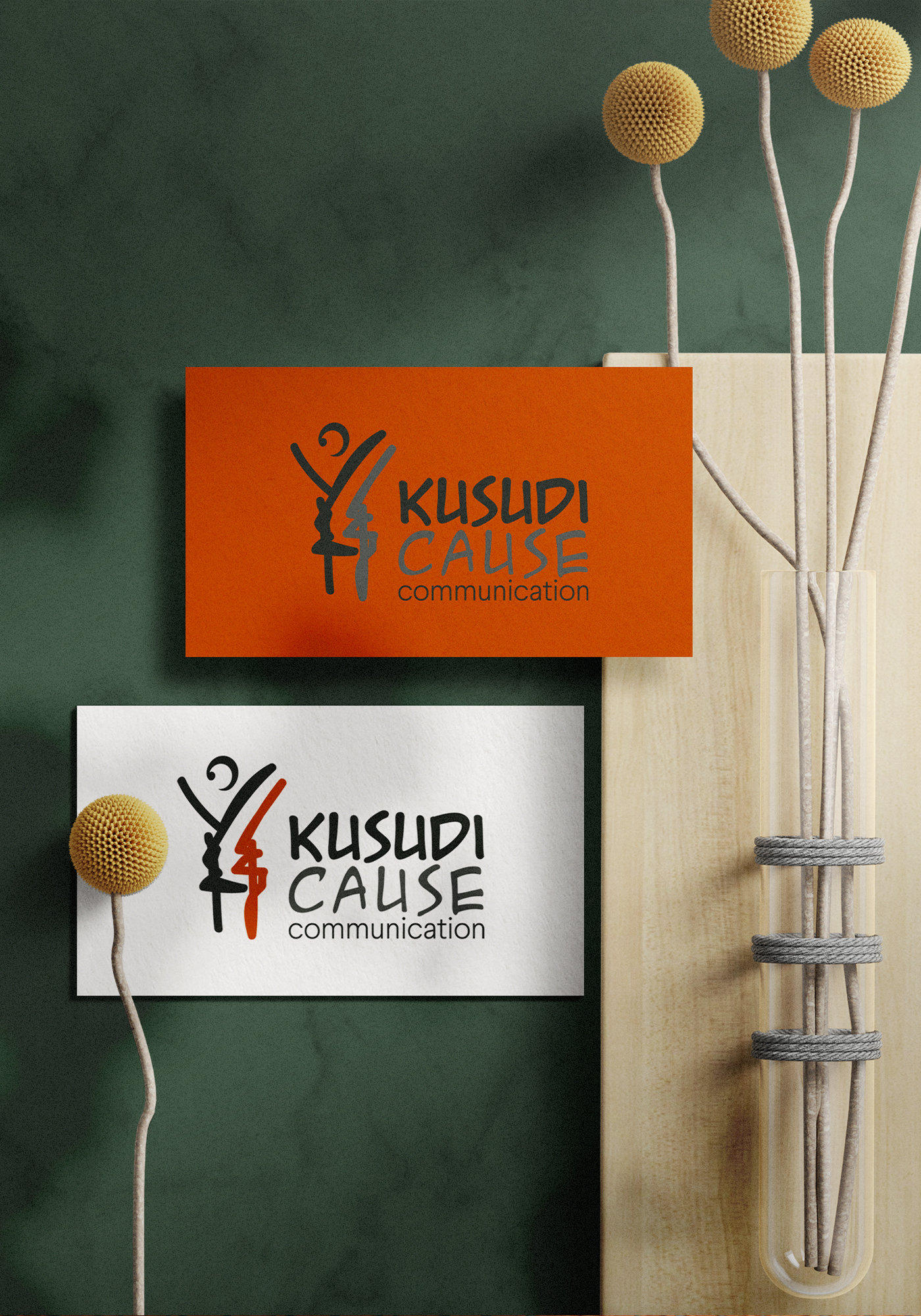
KUSUDI CAUSE COMMUNICATIONS LOGO DESIGN
Client: Impact Africa Limited
-
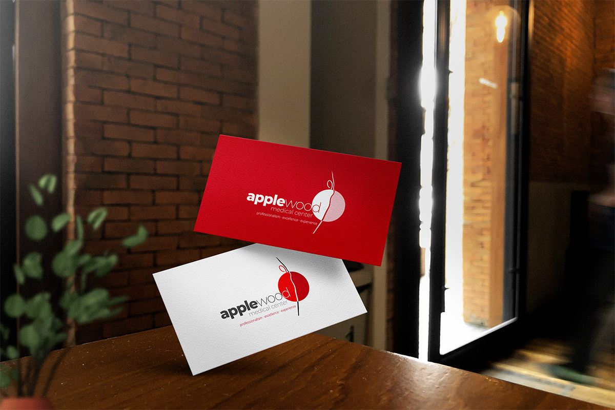
APPLEWOOD MEDICAL CENTER
Client: Applewood Medical Center
Applewood Medical Centre functions as a Healthcare provider in Nairobi. As a Level 3 medical center, its primary focus is the well-being of its patients. For those seeking a dependable clinic in Nairobi, Applewood Medical Centre offers accessible Healthcare options. The facility is fully operational and dedicated to fulfilling the community’s medical requirements. As a recognized medical center, Applewood Medical Centre endeavors to provide consistent and trustworthy Healthcare to all patients. Individuals looking for a suitable “best clinic near me” may find Applewood Medical Centre a practical choice, given its location and operational status.
About Me....
I am a Graphic & Web Designer based in Nairobi Kenya, my skills range from Print Design, Publishing, Packaging, to Branding and Web Design. I have been a professional designer for over nine years, working as a consultant as well a full time designer.
I hold a Bachelors degree in Fine Art and Design from Kenyatta University and a Diploma in Web Design from the Nairobi Institute of Business Studies, Kenya. Design is my passion. I have been doing it all my life! A good design for me is something timeless, elegant, and simple that remains beautiful and relevant over the years.
In a world full of clutter, I'm continuously inspired to create simple, clutter-free designs that communicate effectively. View my full profile here
Enjoyed working with me?

SIMPLE
CREATIVE
PROFESSIONAL
TALENTED
Let’s create together! Please reach out for full-time, part-time, freelance, or consultancy engagements across the following areas:
- Creative Vision & Direction
- Brand Management
- Campaign Planning
- Brand Identity (Logo Design)
- Publication Design
- Editorial Design
- Corporate Communications
- Social Media Strategy
- Packaging Design
- Digital Marketing
- Print Adverstising
- Web Design
Let's make magic happen together.
I'd love to hear from you. I believe in using my talents to positively contribute to society one great design at a time.
Lavington, Nairobi, Kenya. (+254) 724-283766 creative@twinnynavangi.co.ke 10.00am - Till Late (Mon-Fri)